Pricing card
This tailwind example is contributed by Sophia Baker, on 28-Nov-2022. Component is made with Tailwind v3.4. similar terms for this example are Service rates, Subscription plans

Related Examples
-
 "Visit Rwanda" tourism website focusing on wildlife, particularly mountain gorillas
Key Features of This Rwanda Tourism Website: Focus on Mountain Gorillas ("Ingagi"): Dedicated section highlighting gorilla trekking experiences Information about conservation efforts Booking options for gorilla permits Wildlife Showcase: Featured animals including gorillas, golden monkeys, elephants, lions, and more Beautiful image cards for each species Conservation-focused messaging National Parks Information: Sections on Volcanoes, Akagera, and Nyungwe National Parks Visual highlights of each park's unique features User Experience: Responsive design that works on all devices Attractive color scheme inspired by Rwanda's landscapes Easy navigation with clear calls-to-action Practical Information: Contact form for tour inquiries Testimonials from previous visitors Footer with important links and contact details
-
 payement cart virtual
payement cart virtual
467 -
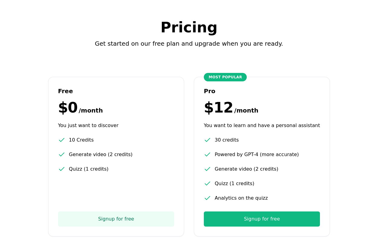 Subscription Plan Cards
compare and choose between different subscription plans. It provides essential information such as plan name, price, features, and a signup button
12.6k -
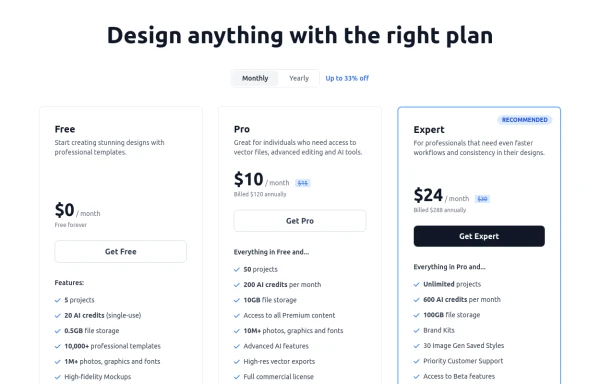 Modern Responsive Pricing Section with Toggle
A sleek, responsive pricing section built with HTML and Tailwind CSS, showcasing three distinct plans (e.g., Free, Pro, Expert) in a card layout. It features a clean monthly/yearly toggle switch with savings indication, highlights a recommended plan with distinct styling and a badge, and uses checkmarks for clear feature comparison. The layout stacks vertically on smaller screens and transitions to a 3-column grid on large screens (lg breakpoint). Includes generic content for easy adaptation and a final "Compare Plans" button.
1.7k -
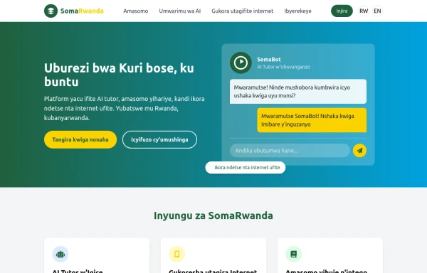 SomaRwanda
Menya uburyo bwo kwandika ibisomwa, impuzandimi, n'imyandikire y'icyongereza mu buryo bworoshye.
-
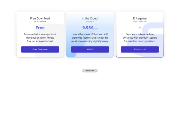 Interactive Pricing Table
This modern pricing component features a visually appealing, responsive layout with smooth hover effects, making it ideal for showcasing different plans and subscription tiers. Design and Features: ✅ Elegant Gradient Backgrounds • Each pricing card has a unique gradient overlay, transitioning from soft gray, blue, or indigo to white, enhancing contrast and visual appeal. • The rounded-2xl design ensures a polished and smooth aesthetic. ✅ Interactive Hover Effects • Cards have a subtle hover shadow enhancement, making them pop on interaction (hover:shadow-[0_0px_25px_0px_rgba(0,0,0,0.2)]). • Slight floating effect (hover:translate-y-[-5px]) gives the illusion of elevation on hover. ✅ Pricing & Plan Details • Each card presents a plan title, a short subtitle, and a bold price display (text-3xl font-extrabold text-indigo-500). • Supports free, subscription-based, and enterprise-tier pricing, ensuring flexibility for different business models. ✅ Call-to-Action Buttons • Each plan features a highly visible CTA button (bg-indigo-700 text-white rounded-md). • The buttons change color on hover (hover:bg-indigo-500) and expand slightly, encouraging user interaction. ✅ Animated Background Icons • A large, transparent icon (text-[500px] text-gray-100) dynamically moves on hover (group-hover:-translate-y-8 group-hover:-translate-x-8), adding depth and a premium feel. This pricing component is perfect for SaaS platforms, digital subscriptions, and service offerings, ensuring a modern, sleek, and engaging user experience. 🚀
2.1k -
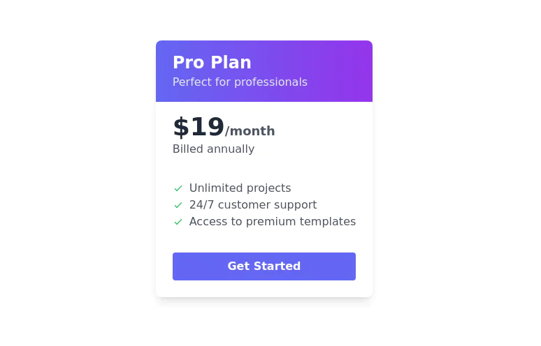 Simple pricing card
minimal pricing card
9.8k -
 Pricing cards - with features list
Flexible Pricing Plans Cards
4.8k -
 pricing Nos Collections du Monde
pricing Nos Collections du Monde
432 -

-
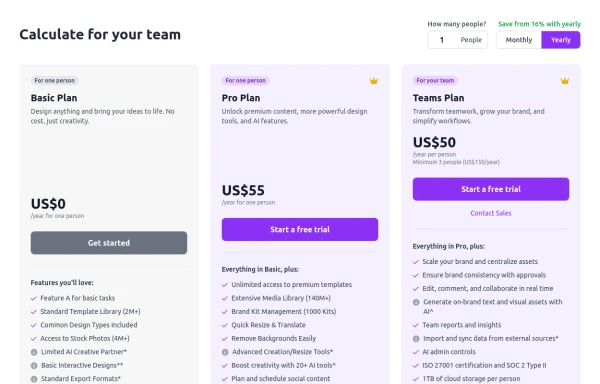 Configurable 3-Tier Responsive Pricing Table
A modern, responsive pricing table component inspired by SaaS layouts, built with HTML and Tailwind CSS. Features three distinct pricing tiers displayed in cards, stacking vertically on smaller screens and transitioning to a 3-column grid on large screens (lg breakpoint). Includes interactive top controls for selecting the number of users and toggling between monthly/yearly billing cycles. Each card uses placeholder content for icons, titles, descriptions, features (with checkmarks/info icons), and distinct call-to-action buttons, making it easily adaptable. Styled with subtle background colors and clear typography for excellent readability.
1.6k -
 Horiizontal Pricing Card
Single pricing plan section







Browse by topic
Explore components by Tags
Jump straight to the UI pattern you need.
Can't find it?
Didn't find the component you were looking for?
Search across 3,000+ community-built components and grab the code in seconds.