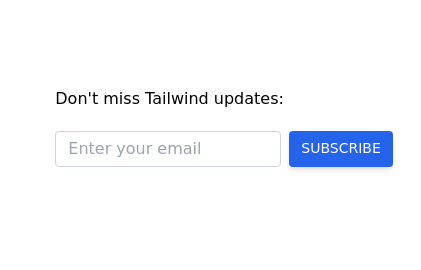
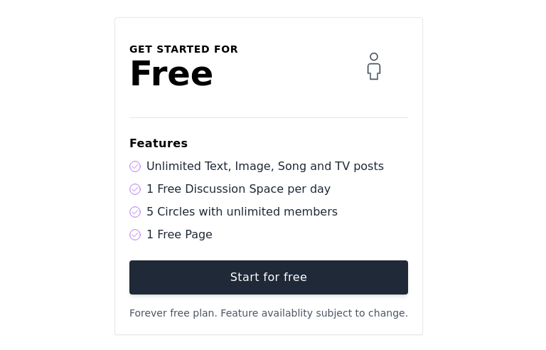
Subscription
Subscription list
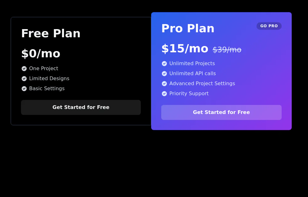
This tailwind example is contributed by Abhiraj, on 22-Feb-2025. Component is made with Tailwind CSS v3. It is responsive. It supports dark mode. similar terms for this example are Service rates, Subscription plans,Email campaign

Author Abhiraj
Related Examples
-
 2 years ago12.1k
 -
 3 years ago9.5k
 -
 8 months ago571
 -
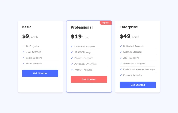 Interactive Pricing Cards
this are pricing cards
8 months ago1k -
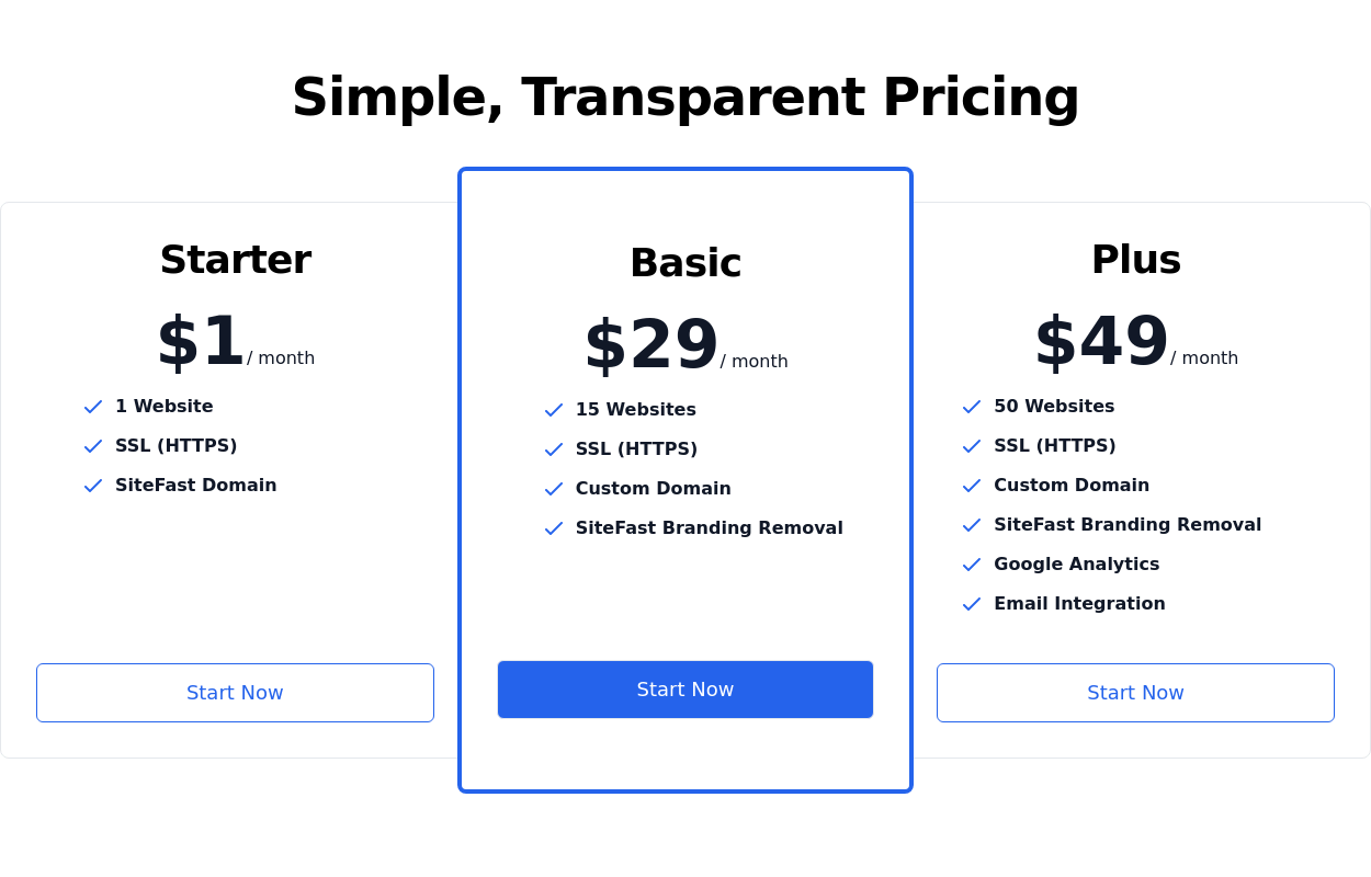 Pricing section
Service/product pricing section
3 years ago13k -
 HighLight
Highlight section. Find it makecomponents.com
1 year ago2.1k -
 3 years ago9.1k
 -
 Services
explore our awesome Services
1 year ago2.8k -
 8 months ago543
 -
 SoungCraft
Used for making and trading songs
8 months ago765 -
 3 years ago11k
 -
 3 years ago11k


Explore components by Tags
Didn't find component you were looking for?
Search from 3000+ components