Simple pricing card
minimal pricing card
This tailwind example is contributed by Anonymous, on 25-Aug-2023. Component is made with Tailwind CSS v3. It is responsive. similar terms for this example are Service rates, Subscription plans

Author Anonymous
Related Examples
-
 2 years ago14k
 -
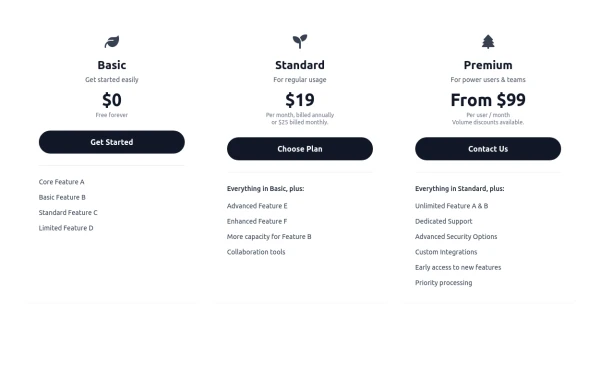 Responsive 3-Tier Pricing Card Section
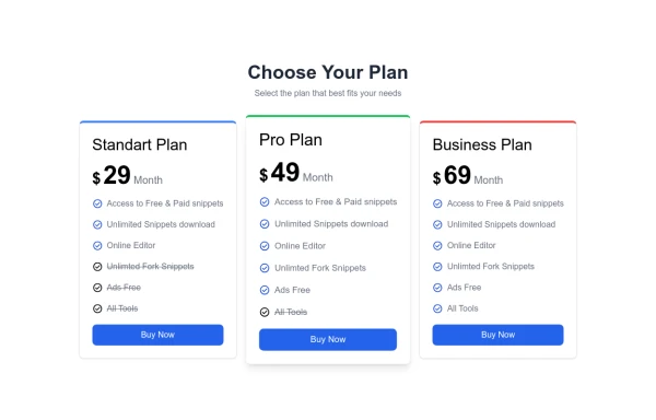
A clean and responsive pricing table component featuring three distinct tiers (e.g., Basic, Standard, Premium) presented in a card layout. Built with HTML and Tailwind CSS, it stacks vertically on small screens and transitions to a side-by-side view on medium screens (md breakpoint - 768px) and up. Each plan card includes a placeholder icon, title, description, price details, a call-to-action button, and a bulleted list of features with checkmarks. The generic content makes it easy to adapt for various websites or applications needing a clear pricing comparison structure.
9 months ago605 -
 Pricing table
Pricing table with background gradient
3 years ago11k -
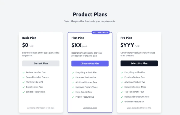 Responsive Multi-Tier Pricing Table Component
flexible and responsive 3-tier pricing table component built with HTML and Tailwind CSS. Features distinct visual styles for different plans (e.g., highlighting a recommended option), adapts to various screen sizes, and supports both light and dark color schemes. Uses generic placeholders for easy adaptation to any product or service.
9 months ago1.4k -
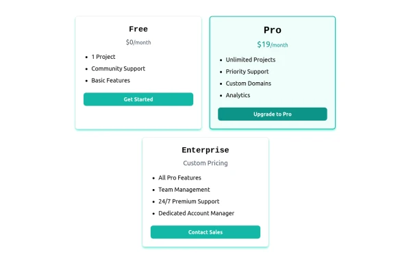 Card pricing section
Absolutely! Here's a beautiful 3-card pricing section using Tailwind CSS, with animations, dark mode support, and clearly differentiated plans (Free, Pro, and Enterprise).
7 months ago822 -
 Pricing Plan Selector
radio buttons for selecting a pricing plan
1 year ago3.7k -
 1 year ago1.6k
 -
 Tiered Pricing Blocks
An organized way to compare different product offerings or pricing tiers. Users can quickly assess the features and pricing for various products.
2 years ago9.4k -
 3 years ago11.4k
 -
 Pricing section - Htmlwind
Single pricing
8 months ago717 -
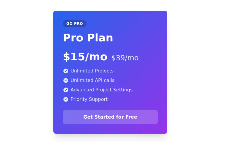
 Pricing Card with gradient background
A sleek and transparent card displaying your product's pricing. It's designed to be both visually appealing and informative, helping users understand your pricing options at a glance.
2 years ago8.3k -
 pricing card
This frontend template is designed for a website that provides software services and open-source code to users. It serves as a clean, modern UI for browsing, searching, and downloading open-source projects. Building with HTML, tailwindcss for CSS ,
5 months ago584


Explore components by Tags
Didn't find component you were looking for?
Search from 3000+ components