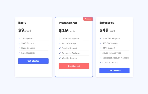
Basic Pricing Cards
highlight and promote different product or service plans
This tailwind example is contributed by Anonymous, on 15-Nov-2023. Component is made with Tailwind v3.4. It is responsive. similar terms for this example are Service rates, Subscription plans

Related Examples
-
 Services
explore our awesome Services
3.6k -
 The Free AI Tools Grid Section (210+ Tools, No Signup)
A responsive and SEO-optimized grid section showcasing over 210 free AI tools. Designed with Tailwind CSS, fully responsive, fast-loading, and built for high user engagement. No sign-up required, privacy-friendly, and optimized for performance and discoverability.https://www.thefreeaitools.com/
-
 Ticket Options ios 26
Ticket Options ios 26
507 -

-

-
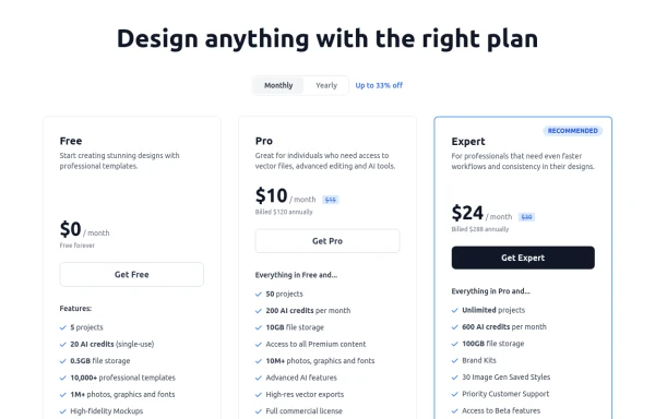 Modern Responsive Pricing Section with Toggle
A sleek, responsive pricing section built with HTML and Tailwind CSS, showcasing three distinct plans (e.g., Free, Pro, Expert) in a card layout. It features a clean monthly/yearly toggle switch with savings indication, highlights a recommended plan with distinct styling and a badge, and uses checkmarks for clear feature comparison. The layout stacks vertically on smaller screens and transitions to a 3-column grid on large screens (lg breakpoint). Includes generic content for easy adaptation and a final "Compare Plans" button.
1.8k -
 10.4k
10.4k -
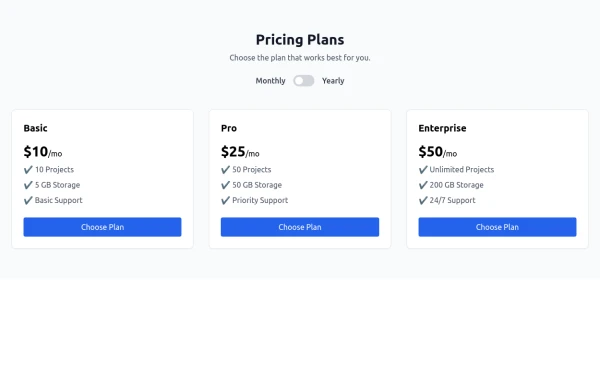 Pricing Plans
Js integrated Pricing Plans
1.4k -
-
 Tailwind Card Components
A collection of 20+ copy-paste ready card components built with pure HTML and Tailwind CSS. Includes product cards, profile cards, article cards, pricing cards, testimonials, and notifications.
1.4k -
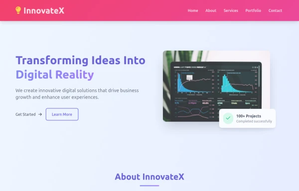 Animated Website
Welcome to our animated and engaging website built with Tailwind CSS. We provide top-notch web design, development, SEO, and consulting services to help your business grow.
1.8k -
 Interactive Pricing Cards
this are pricing cards
1.7k







Browse by topic
Explore components by Tags
Jump straight to the UI pattern you need.
Can't find it?
Didn't find the component you were looking for?
Search across 3,000+ community-built components and grab the code in seconds.