- Home
-
Hello
Hello
This tailwind example is contributed by Saif Al Siam, on 28-Nov-2024. Component is made with Tailwind CSS v3. It is responsive.
Author Saif Al Siam
Related Examples
-
Typewriter effect in tailwindcss with this simple trick
source: https://dev.to/lazysock/make-a-typewriter-effect-with-tailwindcss-in-5-minutes-dc
2 years ago11.3k -
2 years ago9.2k
-
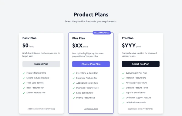
Responsive Multi-Tier Pricing Table Component
flexible and responsive 3-tier pricing table component built with HTML and Tailwind CSS. Features distinct visual styles for different plans (e.g., highlighting a recommended option), adapts to various screen sizes, and supports both light and dark color schemes. Uses generic placeholders for easy adaptation to any product or service.
5 months ago650 -
Checkbox
Checkbox
1 year ago1.7k -
Marquee Slider of Client Logos – Smooth Scrolling Brand Showcase
Enhance your website's credibility with a sleek marquee slider displaying client logos. This continuously scrolling slider provides a dynamic and engaging way to showcase your trusted partnerships, ensuring a professional and visually appealing design. Perfect for businesses, portfolios, and service-based websites.
6 months ago1.2k -
2 years ago17.7k
-
TASK FAILED SUCCESSFULLY
TradingGoose Ep2 MockUp
2 weeks ago94 -
Tailwind CSS Service Card Component
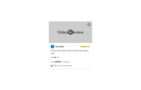
An HTML and Tailwind CSS code snippet for creating a responsive service card component. Ideal for marketplaces, portfolios, or listing pages. Includes sections for image/video preview, seller info, rating, pricing, and additional details. Easy to customize using Tailwind utility classes.
5 months ago836 -
3 months ago613
-
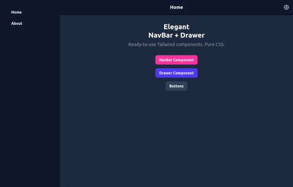
Elegant NavBar + Drawer
A NavBar, a responsive drawer/sidebar, and other useful Tailwind components to get started creating an app. Pure CSS, no JavaScript needed (although this example uses a bit of JS).
4 months ago977 -
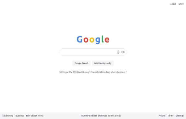
google clone page
This HTML page includes: The Google logo with the correct colors A search input field with microphone and camera icons "Google Search" and "Win Freeing Lucky" buttons The text "With new The ZGS Breakthrough Plus cabinets today's where business ?" Footer with all the links shown in the image: Advertising, Business, New Search works, Privacy, Terms, Settings The climate action text in the footer The layout is responsive and uses Tailwind CSS for styling. The colors match Google's brand colors, and the overall structure matches what's shown in the image.
5 months ago367 -
masonary grids effect for cards using columns
As part of the redesign I was trying to think of ways to lay out testimonials from students, which may have varying length/content, I stumbled onto the idea of using a masonry layout (think bricks, think Pinterest).
6 months ago1.1k
Explore components by Tags
Didn't find component you were looking for?
Search from 2400+ components
