Contact Page
This tailwind example is contributed by Sedat Kumcu, on 29-Oct-2024. Component is made with Tailwind CSS v3. It is responsive. It supports dark mode.

Author Sedat Kumcu
Related Examples
-
 why chose us
Designed with clarity and purpose, each section of our website is crafted to guide users effortlessly from engaging visuals to structured content that highlights our values and builds trust at every scroll. abnahid.com
3 months ago300 -
 pile carde scroll
pile carde scroll
2 weeks ago19 -
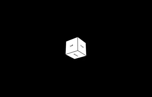 3d Box
Let's build a 3d world empowered by Orgin Dreams.these are 3d objects
8 months ago686 -
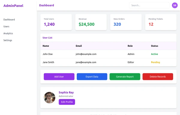 admin panel UI
Premium Admin Panel Pack including sidebar navigation, top navbar, dashboard cards, user tables, quick actions, profile section, and footer. Fully responsive with modern clean design using Tailwind CSS.
7 months ago1.8k -
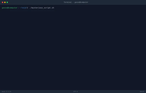 TASK FAILED SUCCESSFULLY
TradingGoose Ep2 MockUp
4 months ago246 -
3 years ago15.3k
-
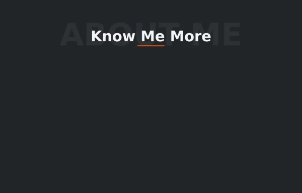 Text Overlay Effect
This is a text overlay effect, featuring a subtle background title and a prominent foreground heading. This design enhances visual interest while maintaining a clean, modern aesthetic.
1 year ago1.6k -
 1 year ago1k
 -
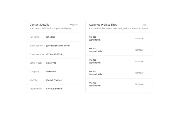 Updated customer details page
Customer details page
1 year ago3.8k -
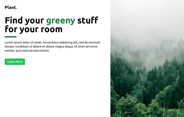 Plant Game
Checking to see if it works
9 months ago927 -
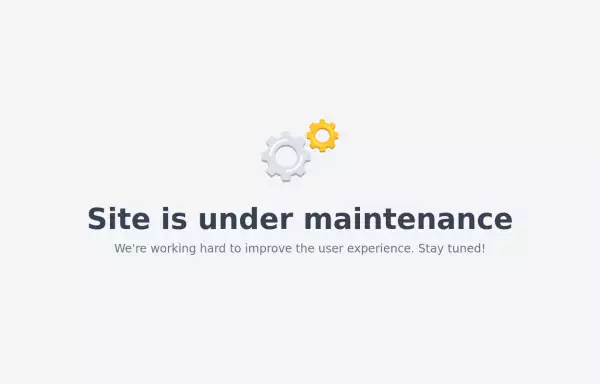 Maintenance page template
The site is under maintenance placeholder page
2 years ago10.5k -
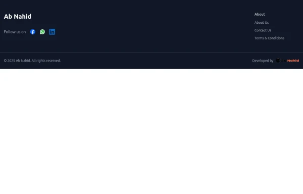 Footer
Elevate your website design with this sleek and minimalist light mode footer component by AB NAHID AGENCY. Crafted for clean UI experiences, it’s perfect for modern web apps, blogs, and business platforms. Easy to integrate, fully responsive, and built with scalability in mind—designed to blend seamlessly with any light-themed layout.
6 months ago699


Explore components by Tags
Didn't find component you were looking for?
Search from 3000+ components