Tailwind CSS Blog sharing buttons with blog details
Introducing our Blog Sharing Buttons with Blog Details component, designed to enhance the social sharing experience on your blog posts.
This tailwind example is contributed by Abid Ullah, on 16-Sep-2024. Component is made with Tailwind CSS v3. It supports dark mode. similar terms for this example are Social media links,,Article Card, Blog page card, Article card

Author Abid Ullah
Related Examples
-
 1 year ago1.5k
 -
 Modern Responsive Footer with Tailwind CSS
This sleek and modern responsive footer is built using HTML and Tailwind CSS. It features three sections: brand information, useful links, and social media icons. The footer includes smooth hover effects, subtle fade-in animations, and a fully responsive design that adapts seamlessly to different screen sizes. Perfect for websites looking for a professional and stylish footer section.
1 year ago2k -
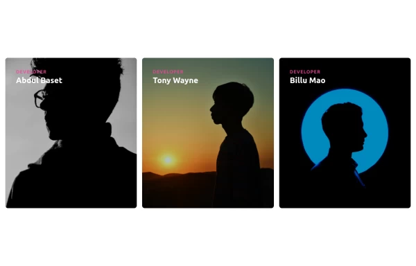 Responsive Cards with Hover Text Reveal Animation - Built with Tailwind CSS
nhance your website with these sleek, responsive cards designed using Tailwind CSS! Featuring a stylish hover animation, the text smoothly reveals when you hover over the card, adding a dynamic touch to your user interface. Perfect for portfolios, team profiles, or project showcases, this design adapts seamlessly to all screen sizes.
10 months ago1.8k -
 Muhammad Umair Arshad - Frontend Developer Resume | React, TypeScript, Tailwind CSS
Professional resume of Muhammad Umair Arshad, a skilled Frontend Developer specializing in React, TypeScript, and Tailwind CSS. I build high-performance web applications with responsive UI design.
10 months ago1.2k -
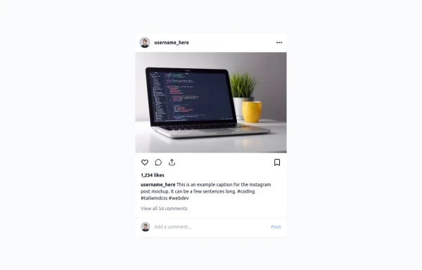 Instagram Post UI Mockup
A static HTML and Tailwind CSS component that visually replicates the user interface of an Instagram post. This mockup includes the post header (avatar, username, options), image area, action buttons (like, comment, share, save), like count, caption, and comment section. It features responsive constraints and supports both light and dark mode, closely mimicking the look and feel of the actual Instagram app. Ideal for UI prototyping, style guides, or frontend development practice.
10 months ago1.3k -
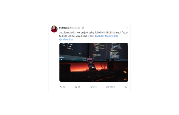 Twitter Post (Tweet) UI Mockup
A detailed static HTML and Tailwind CSS component replicating the user interface of a single Twitter post (Tweet). This mockup includes the user avatar, tweet header (name, handle, timestamp), tweet text with styled hashtags/mentions, optional media display, and the action bar with icons and counts (Reply, Retweet, Like, Views, Share). It is responsive, supports light and dark modes, and uses accurate iconography and hover states to closely resemble the real Twitter UI.
10 months ago760 -
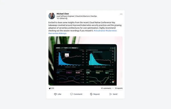 LinkedIn Post UI Mockup
A static HTML and Tailwind CSS component designed to replicate the user interface of a LinkedIn post. This mockup accurately represents the post structure including the header (avatar, name, headline, timestamp), content area (text, optional media), engagement statistics (likes, comments, reposts), and the action bar (Like, Comment, Repost, Send). It's fully responsive, supports light and dark themes, and uses appropriate iconography and styling to closely mimic the LinkedIn feed experience.
10 months ago1.3k -
 YouTube Community Post UI Mockup
A static HTML and Tailwind CSS component mimicking the user interface of a YouTube Community Post. This mockup features the channel header (avatar, name, verified badge, timestamp), post content (text and optional media), engagement actions (Like, Dislike, Comment, Share with counts), and the 'Add a comment' section. It's designed to be responsive, supports YouTube's light and dark themes via custom styling, and uses accurate iconography.
10 months ago965 -
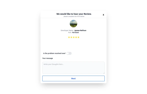 Review popup form with toggle and stars
Review popup form with toggle and stars
10 months ago809 -
 Card post blog
Targetas para blog
3 months ago333 -
 Card blog
Targeta para blog
3 months ago210 -
 pile carde scroll
pile carde scroll
4 weeks ago29


Explore components by Tags
Didn't find component you were looking for?
Search from 3000+ components