Serious Input Html
Input text serious like apple or smth
This tailwind example is contributed by Cristian, on 17-May-2024. Component is made with Tailwind CSS v3. It is responsive. It supports dark mode.

Author Cristian
Related Examples
-
 Date picker
Date picker example using flatpickr library
2 years ago17.3k -
Upvote downvote buttons [alpine]
upvote and downvote buttons made as working version in alpine.js
2 years ago9.1k -
1 year ago3.3k
-
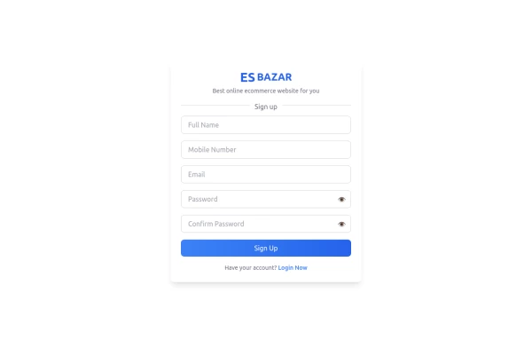 Responsive Sign-Up Form with TailwindCSS
Create a visually appealing and fully responsive sign-up form using TailwindCSS. This form includes input fields for full name, mobile number, email, password, and confirm password, along with a gradient sign-up button. Designed with simplicity and flexibility, it is perfect for modern web applications and easy to integrate into any project.
1 year ago1.5k -
 Review popup form with toggle and stars
Review popup form with toggle and stars
10 months ago901 -
 Premium Gaming UI Card, Form & Animated Button (Tailwind CSS)
A modern, senior-level gaming UI built with Tailwind CSS focusing on spacing, typography, and calm visual hierarchy rather than noisy effects. This component set includes: A premium gaming card with clear content structure and outcome-focused copy A clean player signup form with accessible focus states and minimal visual noise A custom animated button using a restrained light-sweep effect for premium interaction feedback Designed to resemble real production gaming platforms rather than demo or template UI. Fully responsive, copy-paste ready, and easy to extend for real-world projects.
2 months ago218 -
 Fake Medicine Detector
Fake Medicine Detector
9 months ago628 -
 3 years ago13.9k
 -
 Basic Terms of Service Page
Basic Terms of Service Page setup for light and dark mode. Repeat the sections to add as many as you need.
1 year ago3.6k -
 3 years ago10.7k
 -
 magic card
by salvator
9 months ago1.1k -
 Animated Ripple Avatar
Ripple Effect Avatar (Tailwind CSS Component) A visually striking animated component that displays a centered avatar or image surrounded by expanding ripple circles. Built with Tailwind CSS and custom animations, this effect simulates a pulsing or water ripple reaction, drawing attention to the central image. Ideal for user profile sections, hero banners, landing pages, or highlighted features in modern web interfaces. The ripples gradually fade and expand, creating a soft, calming motion that enhances interactivity and depth.
9 months ago1.3k


Explore components by Tags
Didn't find component you were looking for?
Search from 3000+ components