404 Page Not Found
This tailwind example is contributed by KULDEEP, on 24-Jun-2025. Component is made with Tailwind CSS v3. It is responsive. similar terms for this example are 404 pages,Not found,upcoming, Pre-launch page, Teaser page, Under construction page, Placeholder page, Sneak peek page,Launch page

Author KULDEEP
Related Examples
-
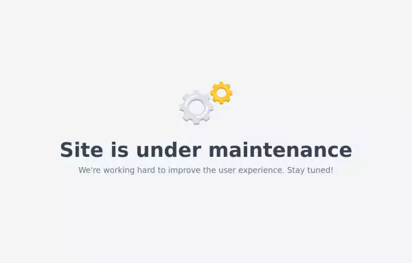 Maintenance page template
The site is under maintenance placeholder page
2 years ago10.3k -
 1 year ago1.7k
 -
 Clean AI Chat UI with Tailwind CSS – ChatGPT-Style Interface
A polished and responsive AI chat interface built using modern Web Components and Tailwind CSS. This UI replicates the smooth, minimal experience of ChatGPT with a clean layout, floating input bar, animated scrollable message feed, and mock AI responses. Ideal for SaaS dashboards, AI assistants, or frontend prototypes. Designed with professional spacing, accessible colors, and reusable components. Key features: Responsive layout with mobile support Floating input bar with auto-expanding textarea Tailwind-powered message bubbles with clear sender roles Modern dark theme with subtle gradients and shadows Easily extendable to real AI APIs (e.g., OpenAI)
8 months ago1.6k -
 omerlinks Calendrier Glassmorphism
omerlinks Calendrier Glassmorphism
1 week ago171 -
 1 month ago270
 -
 1 year ago1.6k
 -
 rotate card
rotate card
1 year ago1.7k -
 4 months ago470
 -
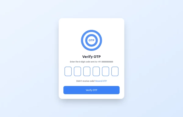 OTP Verification Page
A responsive and interactive OTP verification page built with Tailwind CSS. The page features a gradient background, hover effects, and animations to enhance user experience. It includes input fields for the OTP, a resend OTP link, and a verify button. The design is optimized for both light and dark modes.
11 months ago2.1k -
 Password Generator
This is a simple and responsive Password Generator built with HTML, Vanilla JavaScript, and Tailwind CSS. It allows users to create secure passwords by selecting custom options such as length, uppercase letters, lowercase letters, numbers, and symbols. Ideal for developers or users looking for a fast and customizable password tool.
6 months ago518 -
1 year ago3.1k
-
 1 year ago1.4k


Explore components by Tags
Didn't find component you were looking for?
Search from 3000+ components