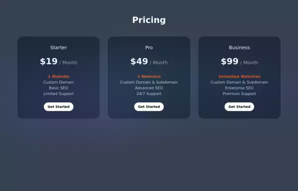
Horiizontal Pricing Card
Single pricing plan section
This tailwind example is contributed by ReddRadar.com, on 24-May-2025. Component is made with Tailwind CSS v3. It is responsive. similar terms for this example are Service rates, Subscription plans

Author ReddRadar.com
Related Examples
-
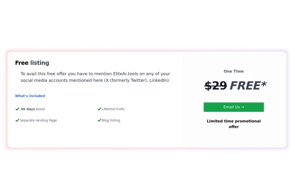
 Product Pricing Section
This component displays pricing plans for your product or service. It provides a clean and visually appealing layout for showcasing different pricing tiers with their respective features and prices.
2 years ago8.8k -
 Pricing Plan Selector
radio buttons for selecting a pricing plan
1 year ago3.6k -
 Subscription
Subscription list
11 months ago849 -
 3 years ago13.3k
 -
 E-commerce Website UI Design
Here is a well-structured UI Design for a general e-commerce website template. This can be used as a reference for designers and developers to build or evaluate the UI components needed for an e-commerce site. View https://github.com/Rathanak-Phan/general-e-commerce-website-template
7 months ago1.8k -
-
 Game
Gameprayer game candle game light candles with your prayers
7 months ago801 -
 8 months ago543
 -
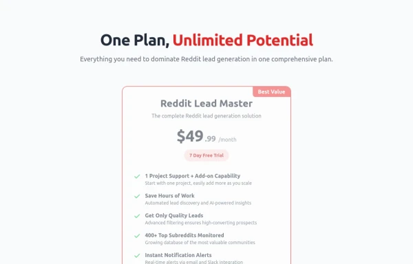
 Lifetime Access — iOS 26 Style
Lifetime Access — iOS 26 Style
1 month ago137 -
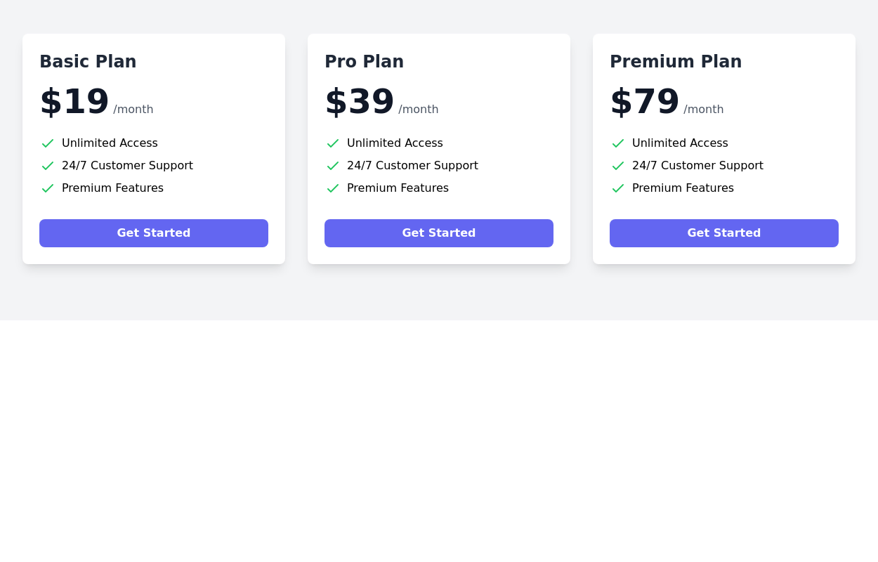
 Pricing comparison table
Showcase different pricing tiers or plans for a product or service.
2 years ago14.4k -
 3 years ago11.4k
 -
 Pricing Table
Modern and visually appealing design
2 years ago6.9k


Explore components by Tags
Didn't find component you were looking for?
Search from 3000+ components