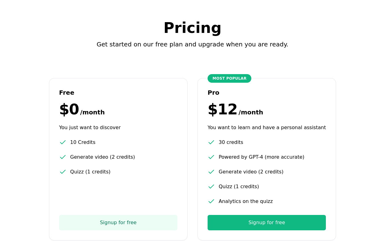
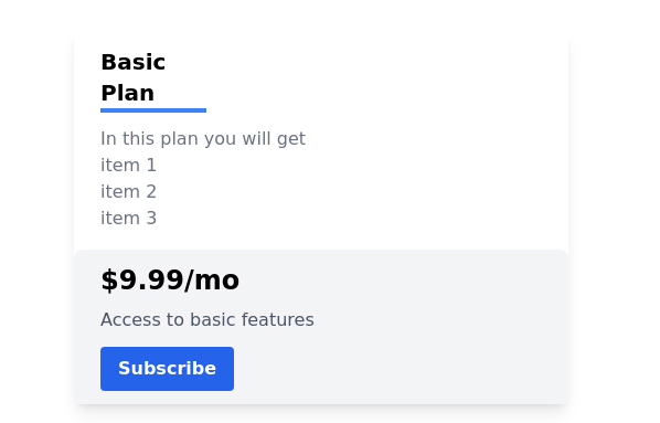
Product Pricing Section
This component displays pricing plans for your product or service. It provides a clean and visually appealing layout for showcasing different pricing tiers with their respective features and prices.
This tailwind example is contributed by Computer guy, on 01-Oct-2023. Component is made with Tailwind CSS v3. It is responsive. similar terms for this example are Service rates, Subscription plans

Author Computer guy
Related Examples
-
 Subscription Plan Cards
compare and choose between different subscription plans. It provides essential information such as plan name, price, features, and a signup button
2 years ago11.8k -
 multiple pricing cards
basic pricing card with single price
2 years ago12.8k -
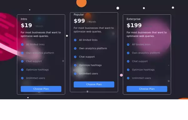
 Tiered Pricing Blocks
An organized way to compare different product offerings or pricing tiers. Users can quickly assess the features and pricing for various products.
2 years ago9.5k -
 2 years ago9.3k
 -
 3 years ago11k
 -
 3 years ago13.4k
 -
 3 years ago14.1k
 -
 Pricing table
pricing table for a software or service offering
3 years ago11.2k -
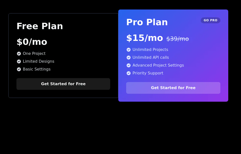
 Pricing card
basic pricing card with single price
2 years ago10.8k -
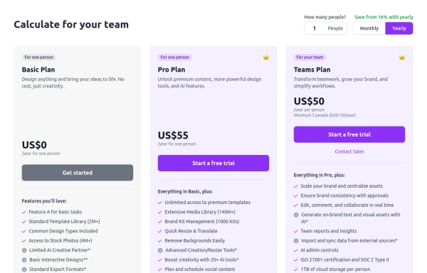 Configurable 3-Tier Responsive Pricing Table
A modern, responsive pricing table component inspired by SaaS layouts, built with HTML and Tailwind CSS. Features three distinct pricing tiers displayed in cards, stacking vertically on smaller screens and transitioning to a 3-column grid on large screens (lg breakpoint). Includes interactive top controls for selecting the number of users and toggling between monthly/yearly billing cycles. Each card uses placeholder content for icons, titles, descriptions, features (with checkmarks/info icons), and distinct call-to-action buttons, making it easily adaptable. Styled with subtle background colors and clear typography for excellent readability.
10 months ago758 -
 3 years ago11.4k
 -


Explore components by Tags
Didn't find component you were looking for?
Search from 3000+ components