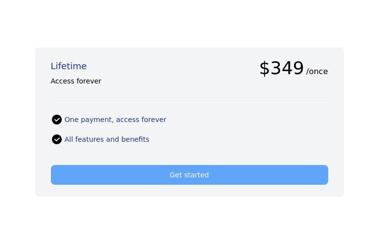
Lifetime Access — iOS 26 Style
Lifetime Access — iOS 26 Style
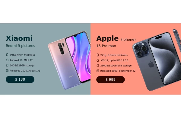
This tailwind example is contributed by Omer fils ELENGA, on 27-Nov-2025. Component is made with Tailwind CSS v3. It is responsive. similar terms for this example are Service rates, Subscription plans

Author Omer fils ELENGA
Related Examples
-
 1 year ago2.4k
 -
 Interactive Multi-Method Donation Section
Overview: A high-trust, conversion-oriented fundraising section styled in the project's signature Navy Blue theme. It provides users with flexible payment options, ranging from one-click fixed amounts to manual bank transfers and cryptocurrency donations. Key Features: Smart Amount Logic: Includes a JavaScript-powered selector where users can choose a preset amount ($10, $25, $50) or type a custom value. The interface automatically toggles states (deselecting buttons when typing, and vice-versa) to prevent user error. Payment Methods: Quick Card/Checkout: Primary call-to-action column. Bank Transfer: A clean card displaying account details with a "Copy to Clipboard" utility. Crypto (Bitcoin): A specialized dark-themed card featuring a placeholder QR code and wallet address copying functionality. Trust Signals: Includes security iconography (lock, shield) and reassuring copy to boost donor confidence. Visual Hierarchy: Uses a 7/5 grid split to prioritize the immediate donation action while keeping manual payment methods accessible but secondary. Tech Stack: Framework: Tailwind CSS. Icons: Ionicons. Scripting: Vanilla JavaScript (for amount toggling and clipboard copying functions). Fonts: DM Serif Display (Headings) + Inter (Body). Usage: Ideal for the "Support Us" page or a dedicated campaign landing page. The script tag included at the bottom handles all the interactivity (button selection and text copying) without needing external libraries.
1 month ago341 -
 2 years ago10.9k
 -
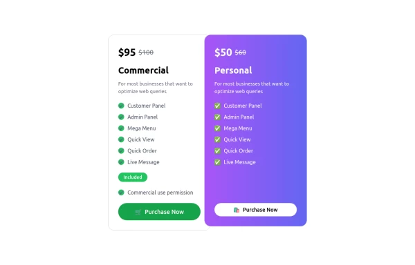 Pricing Table
A modern, responsive Pricing Card Component built with Tailwind CSS. Features dynamic pricing, a feature checklist, and a sleek call-to-action button. Perfect for SaaS, e-commerce, and subscription-based websites. Easily customizable and lightweight.
11 months ago1.7k -
 Pricing card
Reveal details on hover
1 year ago4.3k -
 3 years ago9.1k
 -
 Pricing Plan Selector
radio buttons for selecting a pricing plan
1 year ago3.6k -
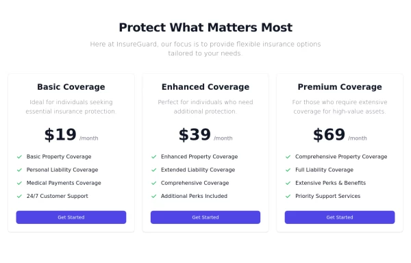
 Pricing Cards
the component is designed to showcase and compare prices between different subscription plans.
2 years ago7.3k -
 HighLight
Highlight section. Find it makecomponents.com
1 year ago2.1k -
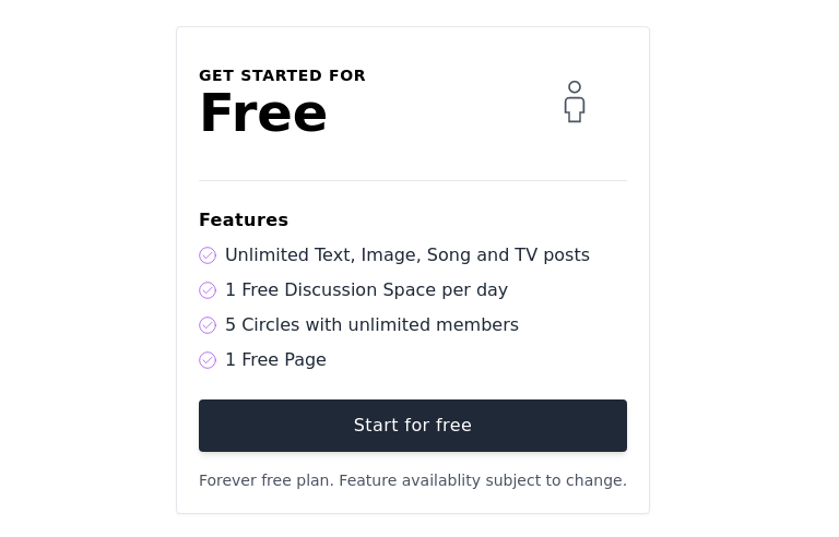
 Tiered Pricing Blocks
An organized way to compare different product offerings or pricing tiers. Users can quickly assess the features and pricing for various products.
2 years ago9.3k -
 pricing
pricing
6 months ago523 -
 Horiizontal Pricing Card
Single pricing plan section
7 months ago751


Explore components by Tags
Didn't find component you were looking for?
Search from 3000+ components