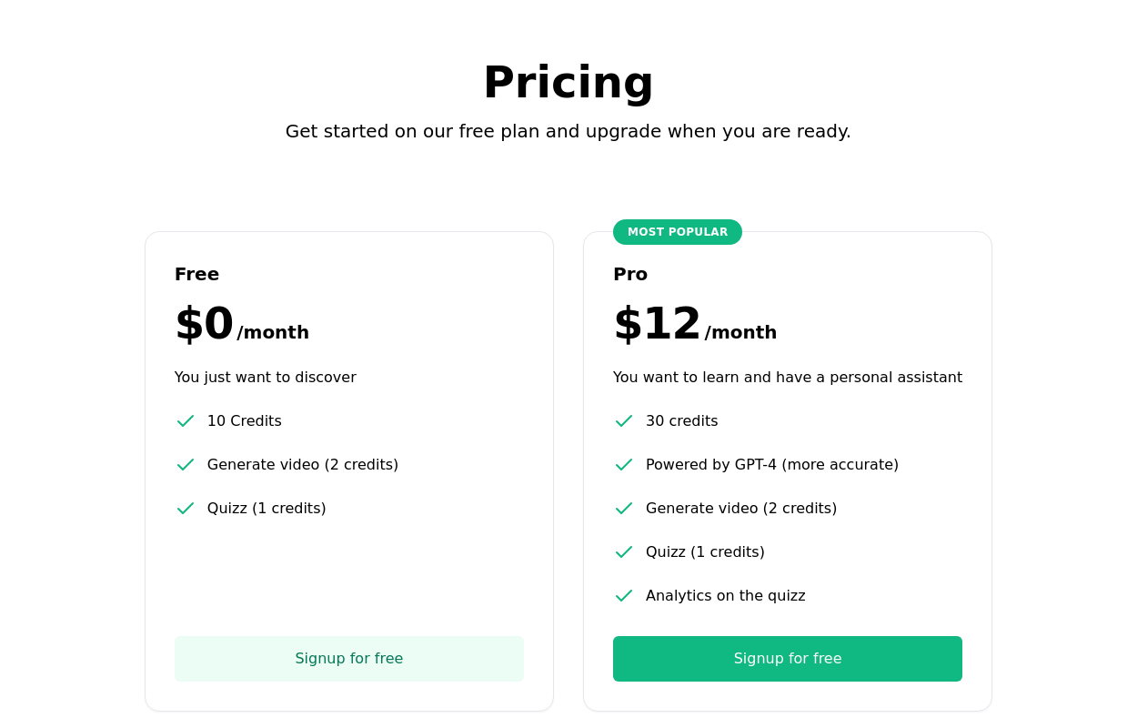
Pricing card single
This tailwind example is contributed by Manuela Bianka, on 22-May-2025. Component is made with Tailwind CSS v3. It is responsive. similar terms for this example are Service rates, Subscription plans

Author Manuela Bianka
Related Examples
-
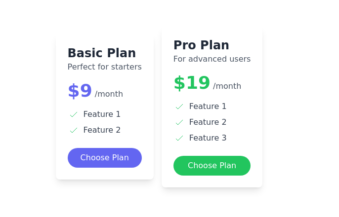
 Subscription Plan Cards
compare and choose between different subscription plans. It provides essential information such as plan name, price, features, and a signup button
2 years ago11.5k -
 Interactive Pricing Cards
this are pricing cards
7 months ago893 -
 3 months ago460
 -
 3 years ago7.2k
 -
 SomaRwanda
Menya uburyo bwo kwandika ibisomwa, impuzandimi, n'imyandikire y'icyongereza mu buryo bworoshye.
6 months ago958 -
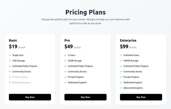
 Pricing comparison table
Showcase different pricing tiers or plans for a product or service.
2 years ago14.3k -
 Pricing section
Pricing table with 3 cards for 3 plans
2 years ago11k -
 Pricing card
basic pricing card with single price
2 months ago85 -
 2 years ago7.4k
 -
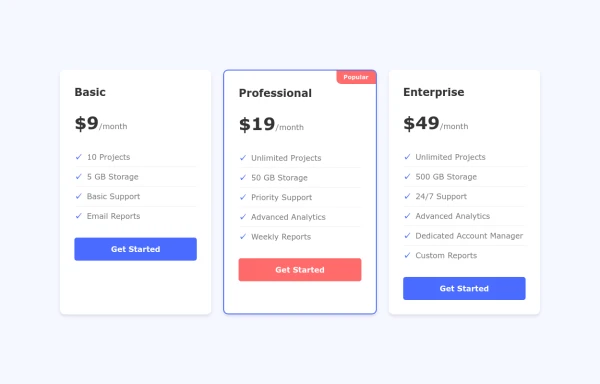
 Pricing cards
pricing section with 3 cards
3 years ago11.7k -
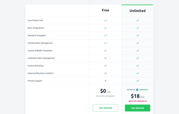 Comparison Pricing Table Component
A responsive pricing table built with HTML and Tailwind CSS, comparing two plans (Free and Unlimited) with a clear feature checklist. Includes distinct styling for the premium plan and a toggle for monthly/annual pricing display.
8 months ago1.3k -
 2 years ago9.2k


Explore components by Tags
Didn't find component you were looking for?
Search from 3000+ components