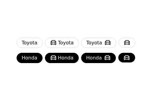
Badges without border
This tailwind example is contributed by Prajwal Hallale, on 18-Aug-2022. Component is made with Tailwind CSS v3.

Author Prajwal Hallale
Related Examples
-
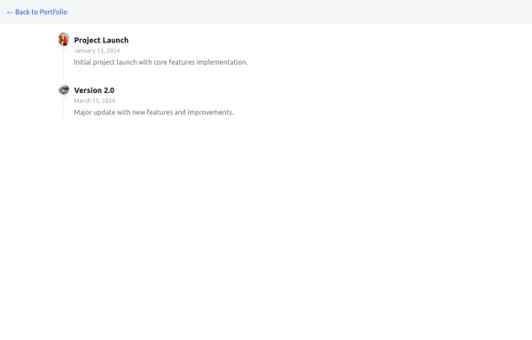 Timeline
timeline with journey
1 year ago1.2k -
 2 years ago8.8k
 -
 3 years ago15.4k
 -
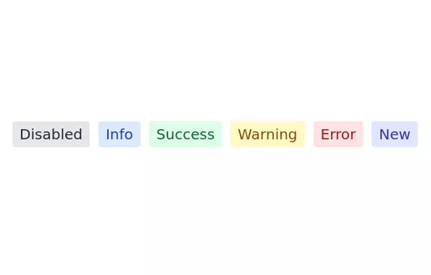
 Info Badges
Badges for showing information about stuff
3 years ago12.3k -
 3 years ago10.5k
 -
 3 years ago10.6k
 -
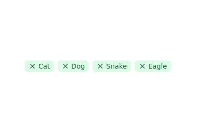 Tags list
click to remove the tag from list
2 years ago11.4k -
 1 year ago2.8k
 -
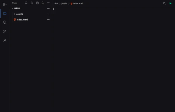 Code Editor UI
Simple code editor prototype made with HTML and TailwindCSS. A lightweight template to explore and customize.
6 months ago471 -
2 years ago7.2k
-
 3 years ago9.3k
 -
 EduGlobal
EduGlobal
7 months ago592


Explore components by Tags
Didn't find component you were looking for?
Search from 3000+ components