Dismissible Buttons
This tailwind example is contributed by Manon Daniel, on 07-Jul-2022. Component is made with Tailwind CSS v3.

Author Manon Daniel
Related Examples
-
3 years ago16.2k
-
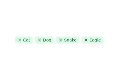 Tags list
click to remove the tag from list
2 years ago11.4k -
 Hashtag Pills
Minimal hastag cloud
3 years ago13.3k -
 2 years ago8.8k
 -
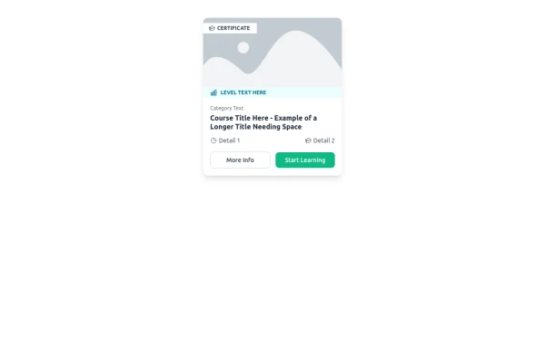 E-Learning Course Card with Badge and Level Indicator
An HTML and Tailwind CSS component mockup for displaying course information. Features include a placeholder image area with an overlaid certificate badge, a distinct level indicator banner below the image, category text, a course title, key details (like duration and learner count placeholders), and primary/secondary action buttons. Designed for e-learning platforms or course listings.
10 months ago1k -
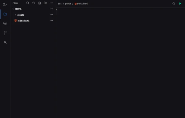 Code Editor UI
Simple code editor prototype made with HTML and TailwindCSS. A lightweight template to explore and customize.
5 months ago470 -
1 year ago2.4k
-
3 years ago12.6k
-
 1 year ago1.9k
 -
 3 years ago14.5k
 -
 shadcn Button
button
1 year ago2.5k -
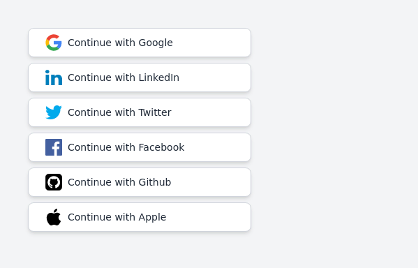 Continue with social login buttons (google, linkedin, twitter, facebook, github, apple)
Login/signup buttons for Google, LinkedIn, Twitter, Facebook, GitHub, and Apple
2 years ago17.6k


Explore components by Tags
Didn't find component you were looking for?
Search from 3000+ components