Badges for showing statuses
This tailwind example is contributed by Mohit Prajapati, on 12-Jul-2022. Component is made with Tailwind CSS v3.

Author Mohit Prajapati
Related Examples
-
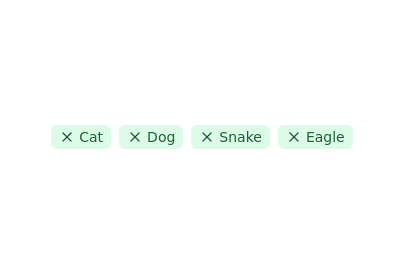 Tags list
click to remove the tag from list
2 years ago11.4k -
 3 years ago12.5k
 -
 Acode Master - FB & WhatsApp UI Combo
Description (meta description) ni tag ikoreshwa mu mutwe (head) wa HTML igaragaza mu ncamake icyo urubuga cyangwa urupapuro rwawe ruvuga. Iyi description ikoreshwa cyane na search engines (nka Google) mu kwerekana summary y’urubuga mu bisubizo by’ubushakashatsi.
9 months ago620 -
 machine
A fully interactive, web-based macOS-style desktop environment featuring draggable and resizable windows, a dynamic Dock with magnification, smooth glass UI effects, adaptive colors, a functional photo gallery with hover menus, and integrated mini-apps like Safari, Notes, Weather, and App Store. Built using HTML, CSS, Tailwind, and JavaScript to recreate a modern OS experience directly in the browser.
3 months ago232 -
 2 years ago8.8k
 -
 3 years ago15.4k
 -
 1 year ago5.9k
 -
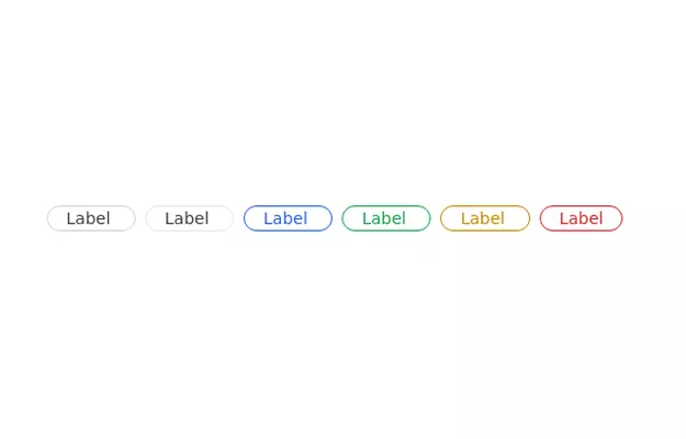
 Elegant Badges
Useful Tailwind classes for creating several types of basic badges.
9 months ago781 -
 3 years ago7.4k
 -
 Info Badges
Badges for showing information about stuff
3 years ago12.3k -
 Badges - Htmlwind
Basic badges
8 months ago548 -
 3 years ago10.2k


Explore components by Tags
Didn't find component you were looking for?
Search from 3000+ components