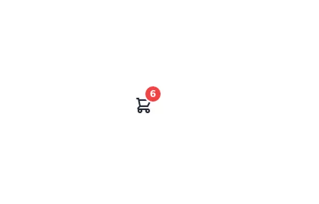
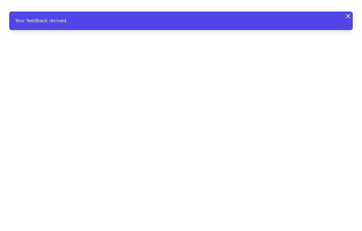
Notification Badge
This tailwind example is contributed by Mr Robot, on 26-Jul-2022. Component is made with Tailwind CSS v3. similar terms for this example are Toast, Snackbar

Author Mr Robot
Related Examples
-
 3 years ago15.4k
 -
 3 years ago14.6k
 -
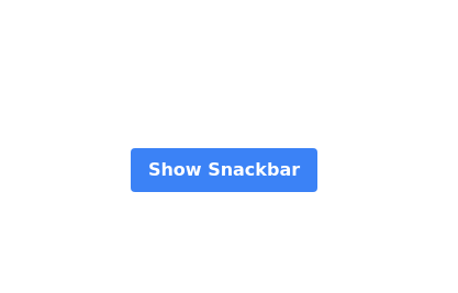 Snackbar with button
Show and close snackbar on button click with default timeout
2 years ago10.9k -
2 years ago7.3k
-
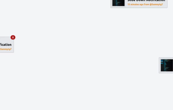
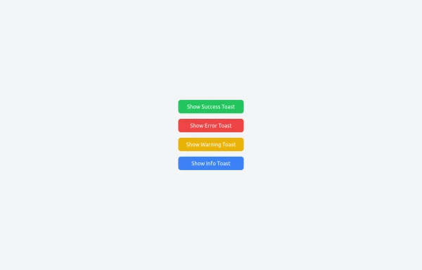 Notifications
Toast Notifications are lightweight and customizable components for displaying short messages or alerts. They are perfect for feedback on user actions, such as form submissions or system updates. Supports different types of notifications (success, error, warning, info). Automatically hides after a specified timeout. Option to include action buttons or close icons. Customizable styles, animation, and position on the screen.
1 year ago1.4k -
 1 year ago6k
 -
 3 years ago10.1k
 -
 Alerts
Provide contextual feedback messages for typical user actions with the handful of available and flexible alert messages.
1 month ago81 -
 background
A background is the area behind the content of an element (like a page, section, or div). It helps define the look and feel by adding colors, images, gradients, or patterns.
10 months ago1.1k -
 1 year ago1.8k
 -
 2 years ago8.7k
 -
 Centre de Notifications
Centre de Notifications
2 weeks ago31


Explore components by Tags
Didn't find component you were looking for?
Search from 3000+ components