Banner for app download
Show App Download Buttons for the App Store and Play Store
This tailwind example is contributed by Pixel Perfect, on 03-Jul-2024. Component is made with Tailwind CSS v3. It is responsive. It supports dark mode. similar terms for this example are CTA,banner

Author Pixel Perfect
Related Examples
-
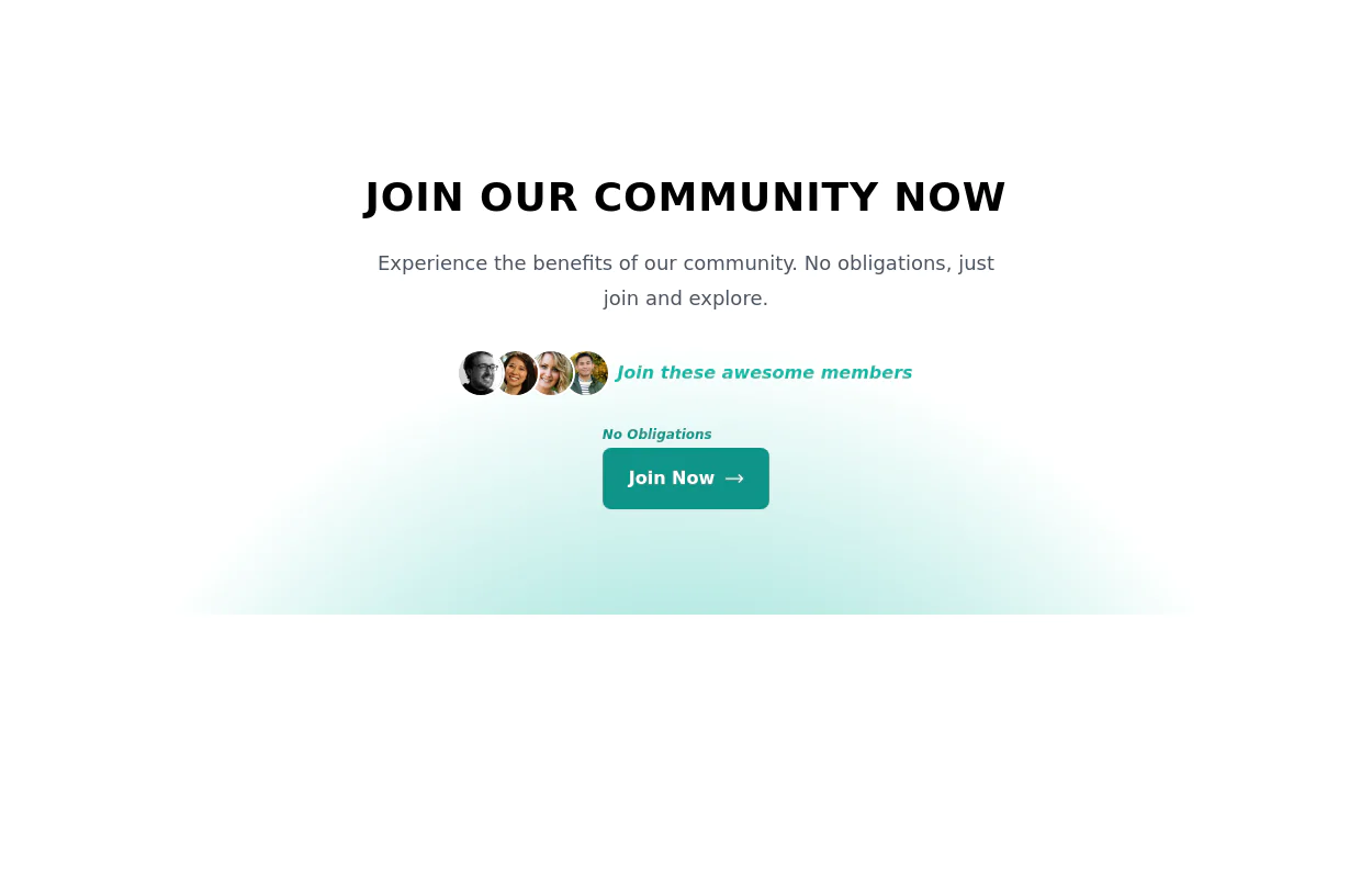 Join Our Community Banner
Encourage users to become members of a community.
2 years ago8.6k -
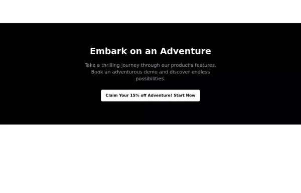 CTA banner
Capture the attention of the user with full-width CTA Section
2 years ago4.7k -
 1 year ago1.8k
 -
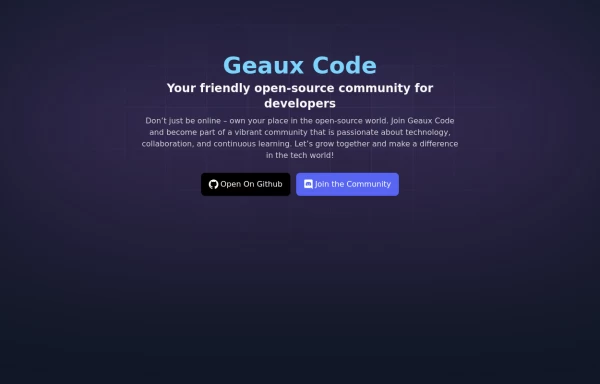 Geaux Code CTA Section
CTA with background patterns
1 year ago2k -
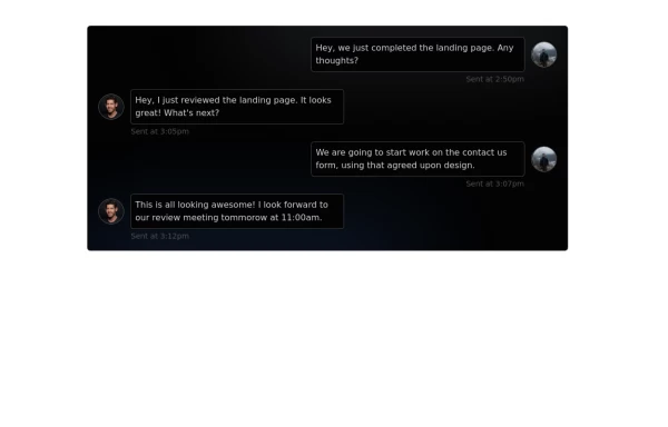 Chat Box for Marketing
An Onyx component. This chat box is great for SAAS landing pages where you want to mock customer interactions or expectations.
1 year ago2k -
 Responsive About Section with Tailwind CSS
Built a sleek and fully responsive About Section for my portfolio using Tailwind CSS! 🚀 Designed for smooth adaptability across all screen sizes with a modern and minimal aesthetic. Perfect for showcasing skills, experience, and a personal touch!
11 months ago1.6k -
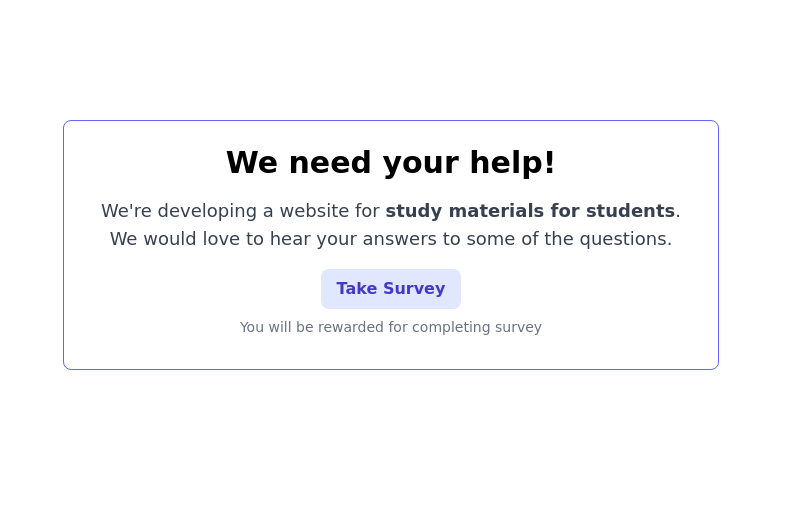 CTA block for "Take our survey"
Get users attention to he survey form
2 years ago9.7k -
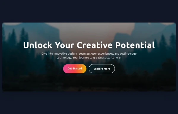 Hero Section
Responsive Hero Section for you Project Background Image: A stunning, high-quality Unsplash photo that creates a unique visual impact. Overlay: Semi-transparent black overlay with blur effect for readability and a modern aesthetic. Content Area: Centered with a gradient background overlay for contrast, bold headline, engaging subtext. Buttons: Vibrant gradient and clean border with smooth hover animations to draw attention. Responsive Design: Looks great on all screen sizes with adaptable padding and font sizes.
8 months ago1.5k -
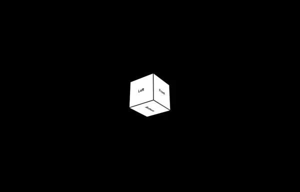 3d Box
Let's build a 3d world empowered by Orgin Dreams.these are 3d objects
9 months ago739 -
![Component-[callToAction]](https://tailwindflex.com/storage/thumbnails/component-calltoaction/canvas.min.webp?v=2) 1 year ago1.1k
1 year ago1.1k -
 CTA Search Section
CTA search form
1 year ago1.3k -
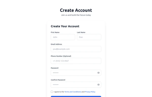 Registration Form with Validation & Success State
A modern and interactive registration form built using Tailwind CSS and Alpine.js, designed for seamless user onboarding with real-time validation and elegant animations. This component includes client-side form validation, dynamic password visibility toggles, and a success confirmation screen with personalized feedback. It’s fully responsive, dark mode–ready, and styled for modern SaaS or startup platforms. ✨ Key Features 🧠 Real-time input validation for required fields (name, email, password, etc.) 🔒 Show/hide password toggle with animated SVG icons ✅ Success message with user details after submission 💨 Animated transitions using Alpine.js 🌙 Dark mode and light mode compatible 📱 Fully responsive across all screen sizes 🧩 Built with pure Tailwind CSS and Alpine.js (no external libraries) 💡 Perfect for: Registration or sign-up pages SaaS onboarding flows Portfolio or agency login systems Form validation demos or UI component libraries
5 months ago290


Explore components by Tags
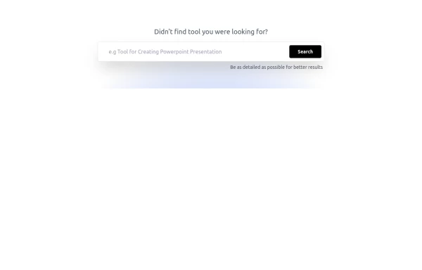
Didn't find component you were looking for?
Search from 3000+ components