Geaux Code CTA Section

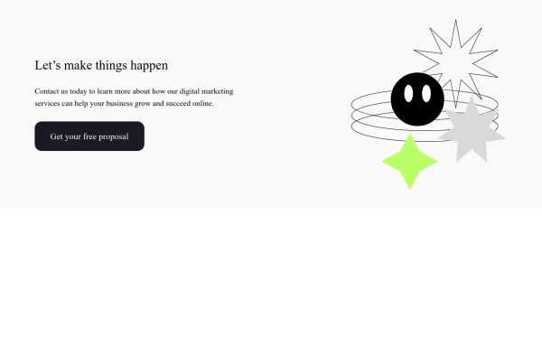
CTA with background patterns

This tailwind example is contributed by Andrew Weisbeck, on 06-Aug-2024. Component is made with Tailwind v3.4. It is responsive. It supports dark mode. similar terms for this example are CTA,banner

Tailwind v3.4 Supports dark mode Responsive 2.6k 11

Related Examples

  • Hero Section

    Full width hero section for landing pages

    15k
  • Call to action

    slightly tilted call to action section

    11.9k
  • Login page

    Login and register page, you can reuse both

    2.6k
  • Applications Showcase

    This is a stylish and interactive application showcase component designed for web use. It features the following elements: Background Styling: The main container has a rounded-rectangle shape (rounded-3xl) with a subtle white base overlaying a high-resolution background image, styled with background-size: 600px for an artistic touch. The image itself dynamically serves as a backdrop, giving the component a layered appearance. Main Icon: A small circular icon, located at the top-right corner, appears with smooth hover effects: Enlarges to double its size (scale-[2]). Rotates (rotate-[410deg]). Moves diagonally upwards-right (translate-x-3, -translate-y-3). These transitions occur over a duration of 1 second (transition duration-1000). Overlay Gradient: A transparent gradient overlay (bg-gradient-to-l) adds a polished depth effect, transitioning from black (from-black/80) to lighter shades. App Icon and Info: Icon: The app icon is a smaller, bordered square image (rounded-2xl) with hover shrink animations (group-hover:scale-95). Text: A bold application title (text-md font-semibold) with hover-animated underline effects that gradually expand from left to right. A short app description styled as secondary text. Call-to-Action Button: Below the card is a subtle, rounded button (rounded-full) encouraging interaction. It features: A hover effect with color inversion (gray to black). A lift effect (hover:-translate-y-1) when hovered. This component is perfect for modern app showcases, offering a dynamic, user-friendly visual experience. It ensures a professional look while engaging users through smooth animations and clear calls to action.

    3.5k
  • Landing page hero section UI

    Modern Hero Section Design

    1.5k
  • Modern CTA section

    CTA with background patterns

  • carde Iptplus

    Iptplus carde

    429
  • Clean & Responsive Footer Design with Tailwind CSS With CTA Button

    modern and responsive footer built with Tailwind CSS to enhance website navigation, accessibility, and user experience. Featuring quick links, social media icons, copyright info, and a sleek layout, this SEO-friendly footer improves engagement and usability across all devices. Perfect for portfolios, business websites, and eCommerce stores!

    1.5k
  • Call-to-Action Card

    Early Access Signup Card

    2.5k

Can't find it?

Didn't find the component you were looking for?

Search across 3,000+ community-built components and grab the code in seconds.