Join Our Community Banner
Encourage users to become members of a community.
This tailwind example is contributed by Diego Chavez, on 04-Oct-2023. Component is made with Tailwind CSS v3. It is responsive. similar terms for this example are CTA,banner

Author Diego Chavez
Related Examples
-
 2 years ago12.9k
 -
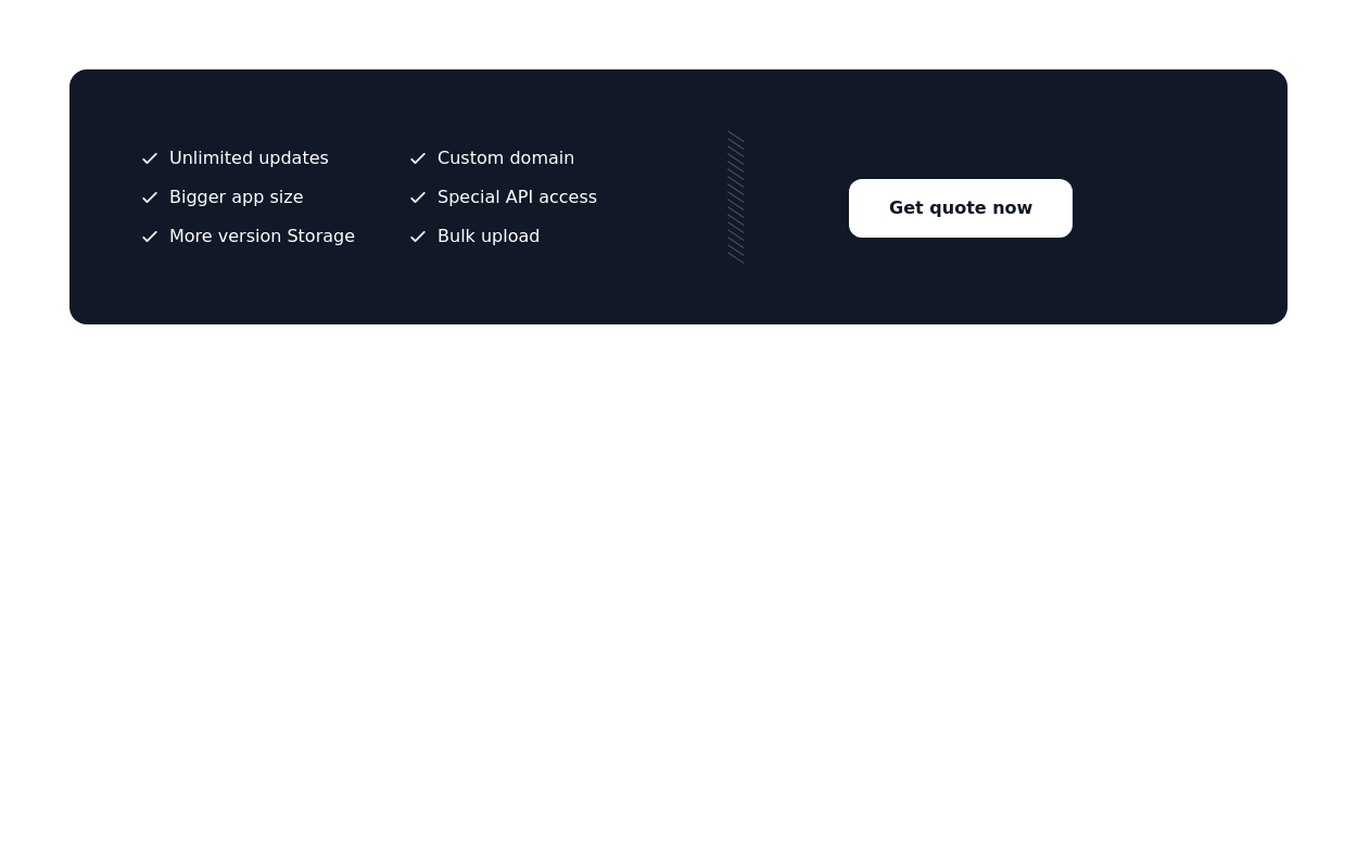
 CTA banner
Capture the attention of the user with full-width CTA Section
2 years ago4.7k -
 3 years ago9.8k
 -
 3 years ago11.7k
 -
 Call to example
Call to example using radial-gradient
3 years ago8.8k -
 Banner for app download
Show App Download Buttons for the App Store and Play Store
1 year ago1.9k -
 1 year ago1.8k
 -
 3 years ago9.5k
 -
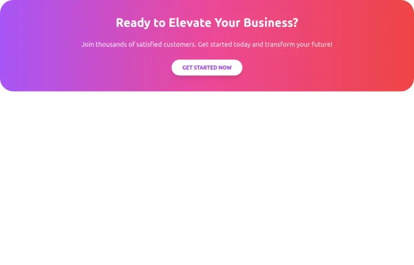 CTA Responsive
Gradient Style CTA
7 months ago586 -
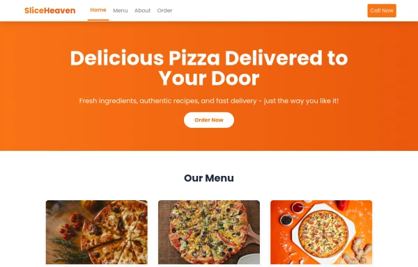 SliceHeaven
delivering pizza
9 months ago808 -
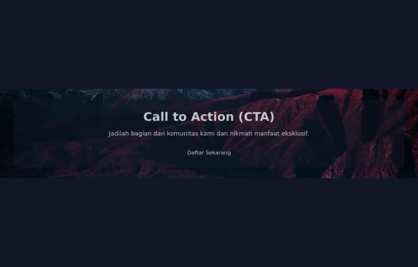 Call to Action (CTA with Background Image)
A Call to Action (CTA) is an essential element in marketing and web design that prompts users to take a specific desired action. When combined with a compelling background image, it can significantly enhance user engagement and conversion rates.
1 year ago2.8k -
 Solo leveling
Animation & movie field,videos,games.
9 months ago993


Explore components by Tags
Didn't find component you were looking for?
Search from 3000+ components