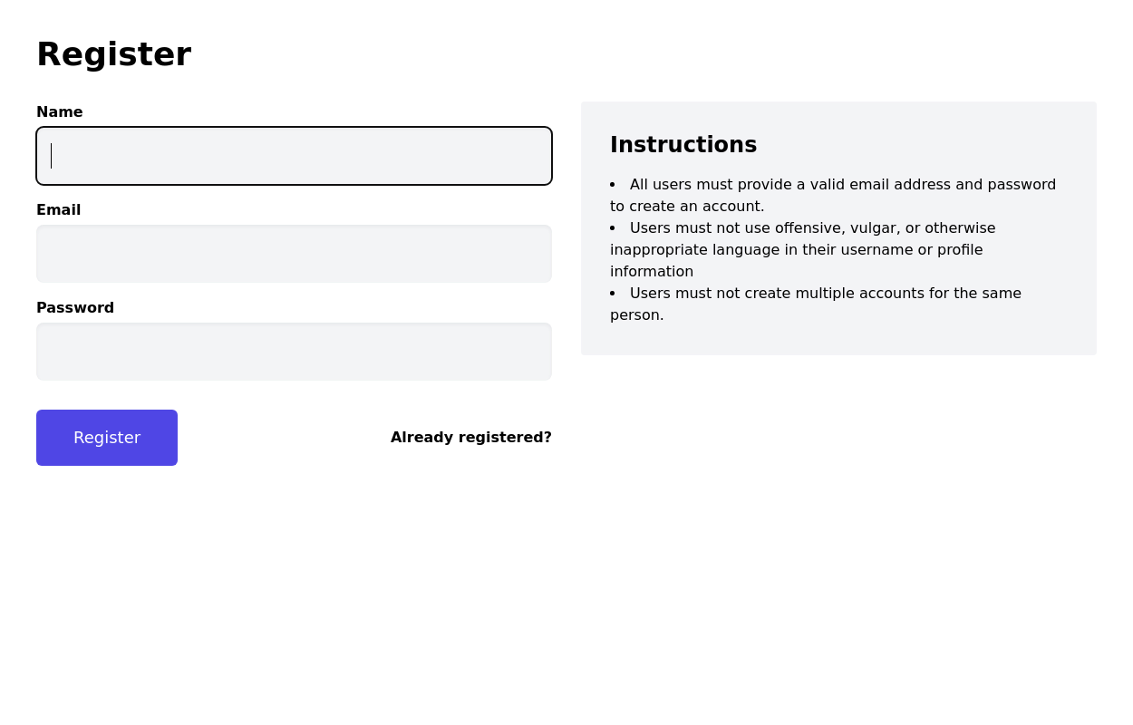
Registration Form with Validation & Success State
A modern and interactive registration form built using Tailwind CSS and Alpine.js, designed for seamless user onboarding with real-time validation and elegant animations.
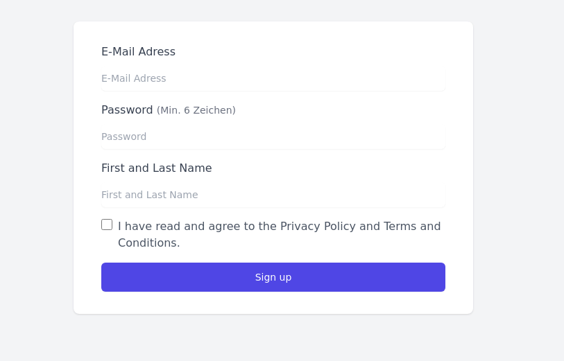
This component includes client-side form validation, dynamic password visibility toggles, and a success confirmation screen with personalized feedback.
It’s fully responsive, dark mode–ready, and styled for modern SaaS or startup platforms.
✨ Key Features
🧠 Real-time input validation for required fields (name, email, password, etc.)
🔒 Show/hide password toggle with animated SVG icons
✅ Success message with user details after submission
💨 Animated transitions using Alpine.js
🌙 Dark mode and light mode compatible
📱 Fully responsive across all screen sizes
🧩 Built with pure Tailwind CSS and Alpine.js (no external libraries)
💡 Perfect for:
Registration or sign-up pages
SaaS onboarding flows
Portfolio or agency login systems
Form validation demos or UI component libraries
This tailwind example is contributed by wavy kits, on 12-Oct-2025. Component is made with Tailwind CSS v3. It is responsive. It supports dark mode. similar terms for this example are CTA,banner,Register, Sign in,Front page

Author wavy kits
Related Examples
-
 3 years ago18.3k
 -
 Login page with tailwind (SB admin 2)
This component features a split-screen design with a background image on one side and a registration form on the other.
3 years ago24.1k -
 3 years ago11.6k
 -
 3 years ago14k
 -
 Simple Login Form
Very basic responsive login form. The form is centered within a white card with a shadow, featuring input fields for username and password. The design is clean and user-friendly.
3 years ago50.1k -
 3 years ago13.1k
 -
 3 years ago12.4k
 -
 3 years ago15.3k
 -
 3 years ago25.3k
 -
 3 years ago24.7k
 -
 3 years ago13.5k
 -
 3 years ago11.7k


Explore components by Tags
Didn't find component you were looking for?
Search from 3000+ components