CTA block for "Take our survey"
Get users attention to he survey form
This tailwind example is contributed by Prajwal Hallale, on 19-Apr-2023. Component is made with Tailwind CSS v3. It is responsive. similar terms for this example are CTA,banner

Author Prajwal Hallale
Related Examples
-
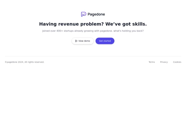 Centered footer with CTA
Use this Tailwind CSS footer compoent for simple footer with center aligned everything and with CTA buttons.
1 year ago2.2k -
 3 years ago10.1k
 -
 CTA section with light beam from bottom effect
It also has support for dark mode
1 year ago2.1k -
 carde Iptplus
Iptplus carde
3 months ago261 -
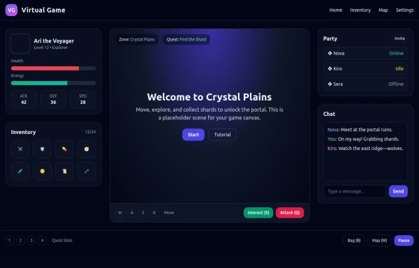 asimple game lay out
asimple game lay out
6 months ago939 -
 2 years ago5k
 -
 CTA Responsive
Gradient Style CTA
8 months ago702 -
 Modern CTA section
CTA banner
1 year ago2.1k -
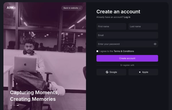 Login page
Login and register page, you can reuse both
1 year ago2k -
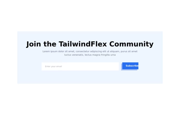 Modern responsive Newsletter form
Responsive newsletter subscriber form
1 year ago3k -
 1 year ago2k
 -
 3 years ago12.1k


Explore components by Tags
Didn't find component you were looking for?
Search from 3000+ components