Responsive Image Carousel with Alpine.js
This component is a fully responsive image carousel/slider that displays:
1 slide at a time on mobile devices (screen width < 768px)
3 slides at a time on desktop (screen width ≥ 768px)
This tailwind example is contributed by Juraj, on 16-May-2025. Component is made with Tailwind CSS v3. It is responsive.

Author Juraj
Related Examples
-
 1 year ago2.9k
 -
 Our services
Component: Interactive Services Carousel Overview: A card-based carousel built with HTML5 and Tailwind CSS, powered by Vanilla JavaScript. It displays Adeoar's 6 main services with a responsive layout and smooth transitions. Technical Features: Responsive: Displays 3 columns on desktop (md breakpoint) and 1 column on mobile devices. Dependencies: Tailwind CSS (CDN or compiled) + Native JavaScript (no external libraries like Swiper or Slick required). Icons: Inline SVG icons (Heroicons style). Functionalities: Navigation: Side buttons (prev/next) and bottom pagination (indicator dots). Automation: Autoplay runs every 4 seconds (infinite loop logic). Interaction: Autoplay pauses automatically on mouse hover (mouseenter/mouseleave). Style & Design (UX/UI): Default State: White background, soft shadows, pastel-colored icon backgrounds. Hover State (Active): Zoom Effect: The card scales up (scale-105). Color Inversion: Background changes to Navy Blue (bg-blue-900) and text turns white for high contrast. Details: The icon background turns white, and the icon stroke takes the dark blue color.
3 months ago347 -
 Tailwind image slider
slider with navigation buttons and info about image
2 years ago20.8k -
 1 year ago7.1k
 -
 grid masoneri
grid masoneri
1 month ago85 -
 Responsive Image Carousel with Alpine.js
This component is a fully responsive image carousel/slider that displays: 1 slide at a time on mobile devices (screen width < 768px) 3 slides at a time on desktop (screen width ≥ 768px)
3 months ago420 -
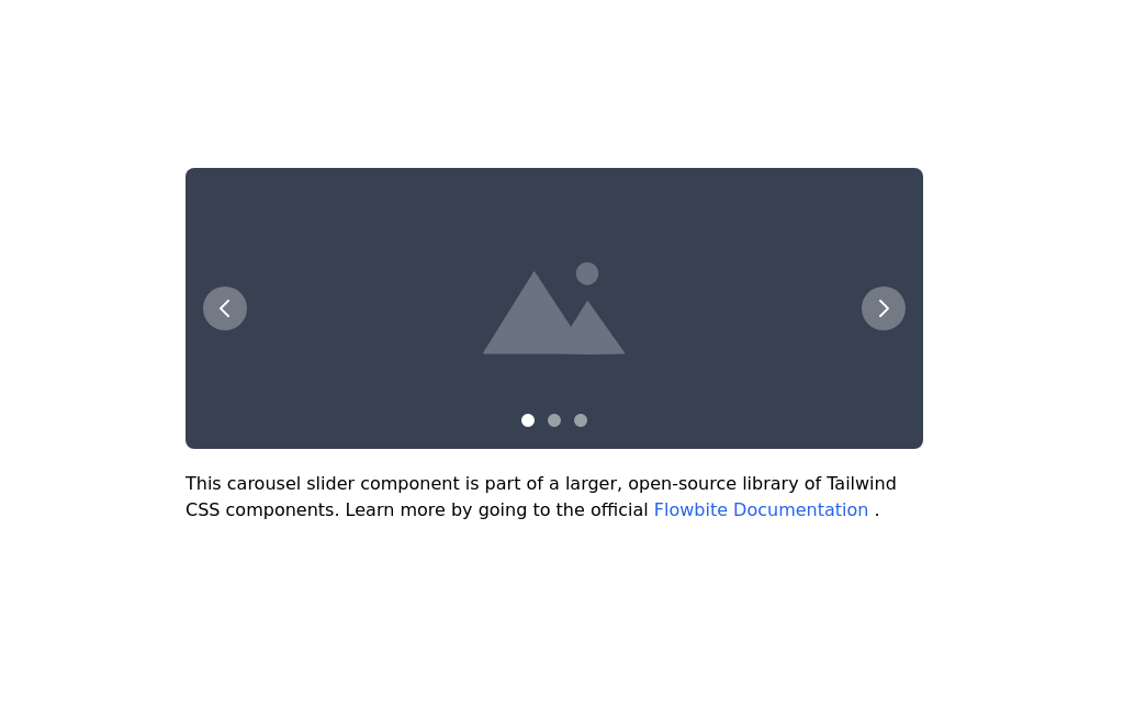 Image carousel
Uses Flowbite
3 years ago31.4k -
 10 months ago1.7k
 -
 Slider
Responsive slider
1 year ago2.4k -
 Simple Multi-Purpose Slider
This is a very minimalistic though very usable slider for various situations like CTA's, quotes or other uncomplicated content. I only used Tailwindcss which makes it very lightweight, but due to limitations it's not as flexible as I wished for. This could be easily achieved by a little piece of JS to make it as dynamic as you wish.
1 year ago2.4k -
 responsive slider carousel
slider carousel
1 year ago2.3k -
 Hero Section
Responsive Hero Section for you Project Background Image: A stunning, high-quality Unsplash photo that creates a unique visual impact. Overlay: Semi-transparent black overlay with blur effect for readability and a modern aesthetic. Content Area: Centered with a gradient background overlay for contrast, bold headline, engaging subtext. Buttons: Vibrant gradient and clean border with smooth hover animations to draw attention. Responsive Design: Looks great on all screen sizes with adaptable padding and font sizes.
8 months ago1.5k


Explore components by Tags
Didn't find component you were looking for?
Search from 3000+ components