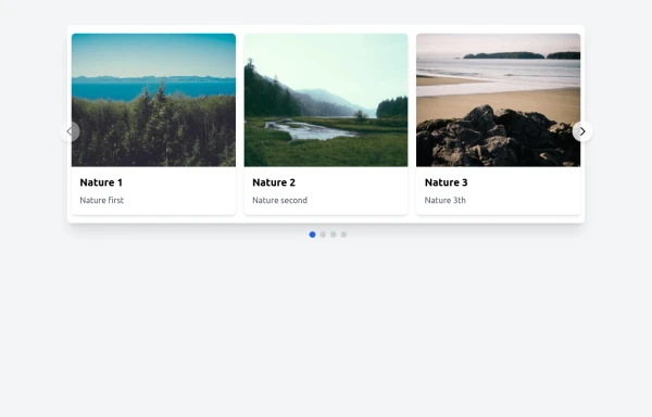
Responsive Image Carousel with Alpine.js
This component is a fully responsive image carousel/slider that displays:
1 slide at a time on mobile devices (screen width < 768px)
3 slides at a time on desktop (screen width ≥ 768px)
This tailwind example is contributed by Salah eldein, on 07-Nov-2025. Component is made with Tailwind CSS v3. It is responsive.

Author Salah eldein
Related Examples
-
 Premium High-Performance Web Gaming Hub
Experience the future of browser-based gaming. I’ve developed a premium arcade hub designed for speed, clarity, and zero-latency gameplay. Built with modern web technologies, Ayyamperumal Games brings AAA-inspired visuals and high-octane mechanics directly to your browser—no downloads, no lag, just pure performance. Explore a curated library of titles ranging from minimalist logic puzzles like Sudoku Elite to fast-paced action in Neon Drift. This is where clean code meets high-level entertainment.
2 months ago433 -
 pile carde scroll
pile carde scroll
2 months ago138 -
 Responsive Image Carousel with Alpine.js
This component is a fully responsive image carousel/slider that displays: 1 slide at a time on mobile devices (screen width < 768px) 3 slides at a time on desktop (screen width ≥ 768px)
10 months ago1.9k -
 ArtoGallery
Explore a curated selection of contemporary and classic artwork, connecting collectors and creators in an inspiring online space.
10 months ago1.3k -
 1 year ago2.7k
 -
 Responsive Image Carousel with Alpine.js
This component is a fully responsive image carousel/slider that displays: 1 slide at a time on mobile devices (screen width < 768px) 3 slides at a time on desktop (screen width ≥ 768px)
4 months ago349 -
 Image carousel
Uses Flowbite
3 years ago31.5k -
 11 months ago1.8k
 -
 Tailwind image slider
slider with navigation buttons and info about image
2 years ago21k -
 1 year ago2.9k
 -
 Nice and simple carousel
Nice and simple carousel, fully responsive.
1 year ago4.1k -
 1 year ago7k


Explore components by Tags
Didn't find component you were looking for?
Search from 3000+ components