carousel
This tailwind example is contributed by Crimson, on 14-Jan-2025. Component is made with Tailwind v3.4. It is responsive.

Related Examples
-
 tinderclone By omerlinks
tinderclone By omerlinks
632 -
 PlayStore Style Carousel
PlayStore Style Carousel
402 -
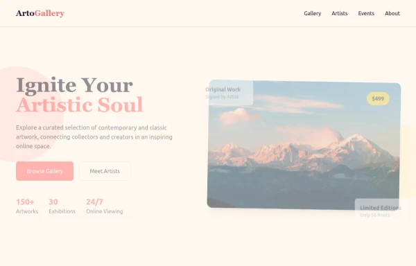 ArtoGallery
Explore a curated selection of contemporary and classic artwork, connecting collectors and creators in an inspiring online space.
2k -
 3D Animated Image Gallery
3D Animated Image Gallery
9.9k -
 Responsive Image Carousel with Alpine.js
This component is a fully responsive image carousel/slider that displays: 1 slide at a time on mobile devices (screen width < 768px) 3 slides at a time on desktop (screen width ≥ 768px)
756 -
 Linear dinamique section by Raul antonio de la cruz hernandez remix omerlinx responsive
Linear dinamique section by Raul antonio de la cruz hernandez remix omerlinx responsive
902 -
 Premium Testimonial Carousel
It is a premium Testimonial Carousel
2.3k -
 responsive slider carousel
slider carousel
3.2k -
 8.1k
8.1k -
 Our services
Component: Interactive Services Carousel Overview: A card-based carousel built with HTML5 and Tailwind CSS, powered by Vanilla JavaScript. It displays Adeoar's 6 main services with a responsive layout and smooth transitions. Technical Features: Responsive: Displays 3 columns on desktop (md breakpoint) and 1 column on mobile devices. Dependencies: Tailwind CSS (CDN or compiled) + Native JavaScript (no external libraries like Swiper or Slick required). Icons: Inline SVG icons (Heroicons style). Functionalities: Navigation: Side buttons (prev/next) and bottom pagination (indicator dots). Automation: Autoplay runs every 4 seconds (infinite loop logic). Interaction: Autoplay pauses automatically on mouse hover (mouseenter/mouseleave). Style & Design (UX/UI): Default State: White background, soft shadows, pastel-colored icon backgrounds. Hover State (Active): Zoom Effect: The card scales up (scale-105). Color Inversion: Background changes to Navy Blue (bg-blue-900) and text turns white for high contrast. Details: The icon background turns white, and the icon stroke takes the dark blue color.
1.2k -

-
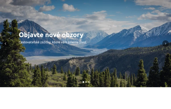 Hero Slider with Alpine.js
This responsive hero slider features full-screen image backgrounds with elegant text overlays and smooth transitions.
2.8k





Browse by topic
Explore components by Tags
Jump straight to the UI pattern you need.
Can't find it?
Didn't find the component you were looking for?
Search across 3,000+ community-built components and grab the code in seconds.