grid masoneri
grid masoneri
This tailwind example is contributed by Omer fils ELENGA, on 08-Jan-2026. Component is made with Tailwind CSS v3. It is responsive.

Author Omer fils ELENGA
Related Examples
-
 omerlinkStream
omerlinkStream
2 months ago532 -
 Premium Testimonial Carousel
It is a premium Testimonial Carousel
10 months ago1.9k -
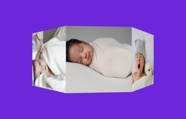 3D Animated Image Gallery
3D Animated Image Gallery
1 year ago9k -
 Simple Animated Carousel
A simple, animated 2:1 carousel with touch swipe support, based on perky98/Juraj's carousel.
10 months ago1.3k -
 tinderclone By omerlinks
tinderclone By omerlinks
2 months ago167 -
 Image carousel
Uses Flowbite
3 years ago31.5k -
 Responsive Image Carousel with Alpine.js
This component is a fully responsive image carousel/slider that displays: 1 slide at a time on mobile devices (screen width < 768px) 3 slides at a time on desktop (screen width ≥ 768px)
4 months ago349 -
 Simple Multi-Purpose Slider
This is a very minimalistic though very usable slider for various situations like CTA's, quotes or other uncomplicated content. I only used Tailwindcss which makes it very lightweight, but due to limitations it's not as flexible as I wished for. This could be easily achieved by a little piece of JS to make it as dynamic as you wish.
1 year ago2.6k -
 Slider
Responsive slider
1 year ago2.6k -
 11 months ago1.8k
 -
 responsive slider carousel
slider carousel
1 year ago2.5k -
 Responsive Image Carousel with Alpine.js
This component is a fully responsive image carousel/slider that displays: 1 slide at a time on mobile devices (screen width < 768px) 3 slides at a time on desktop (screen width ≥ 768px)
4 months ago504


Explore components by Tags
Didn't find component you were looking for?
Search from 3000+ components