Image Carousel
This tailwind example is contributed by Nikolai, on 11-Mar-2024. Component is made with Tailwind CSS v3. It is responsive.

Author Nikolai
Related Examples
-
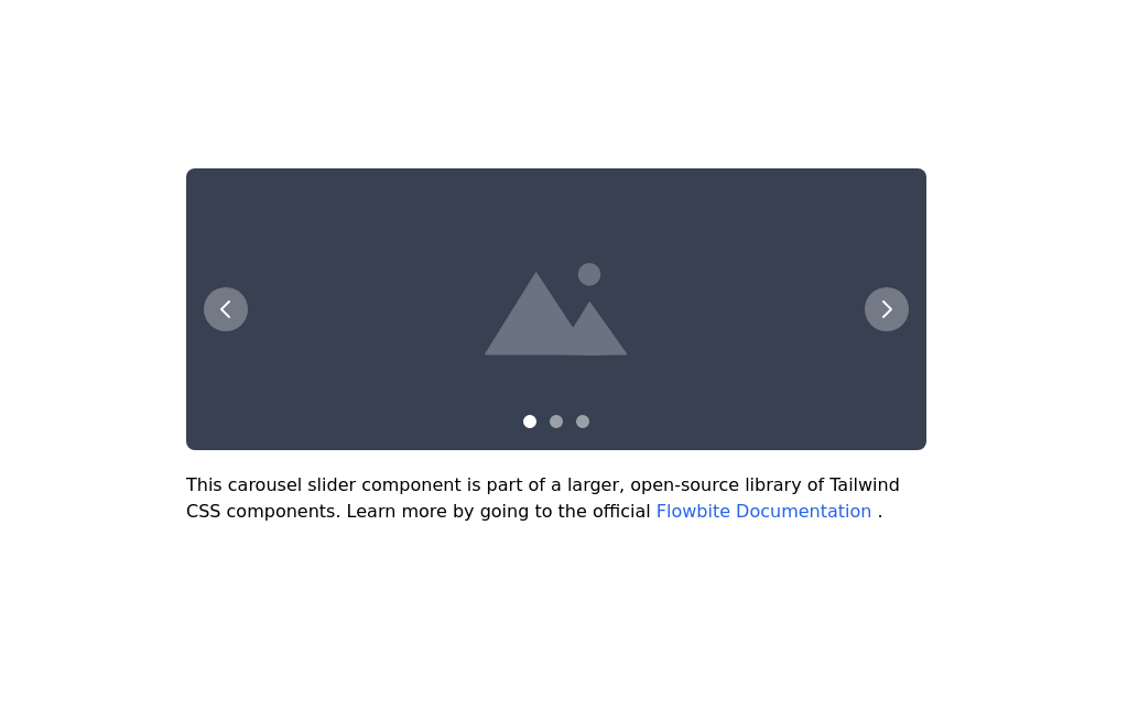 Image carousel
Uses Flowbite
3 years ago31.4k -
 Carousel with Tailwind CSS and Alpine.js
Simple card Carousel
3 years ago31.9k -
 Tailwind image slider
slider with navigation buttons and info about image
2 years ago20.8k -
 3 columns blog section
de columnis, columni, 3 columns
2 years ago12.1k -
 3D Animated Image Gallery
3D Animated Image Gallery
1 year ago8.9k -
 Carousel Card Slider Swiper on Alpine.JS
with support drag and drop mouse actions
1 year ago13.3k -
 Responsive Image Carousel with Alpine.js
This component is a fully responsive image carousel/slider that displays: 1 slide at a time on mobile devices (screen width < 768px) 3 slides at a time on desktop (screen width ≥ 768px)
3 months ago420 -
 tinderclone By omerlinks
tinderclone By omerlinks
1 month ago67 -
 Responsive Image Carousel with Alpine.js
This component is a fully responsive image carousel/slider that displays: 1 slide at a time on mobile devices (screen width < 768px) 3 slides at a time on desktop (screen width ≥ 768px)
3 months ago240 -
 pile carde scroll
pile carde scroll
1 month ago126 -
 slider /carousel
simple slider or carousel
9 months ago1.2k -
 Simple Animated Carousel
A simple, animated 2:1 carousel with touch swipe support, based on perky98/Juraj's carousel.
10 months ago1.2k


Explore components by Tags
Didn't find component you were looking for?
Search from 3000+ components