Horizontal footer
Use this horizontal footer tailwind css example if you want horizontal footer layout side by side, which includes sitemap links, brand logo and social media accounts.
This tailwind example is contributed by Pagedone, on 02-May-2024. Component is made with Tailwind CSS v3. It is responsive.

Author Pagedone
Related Examples
-
 beautifull web page
I create a web page using cloude ai its amazing.
1 year ago3.2k -
 Responsive footer
Standard footer format
2 years ago3.3k -
 Responsive Footer
source: https://kitwind.io/products/kometa/components/footers
3 years ago16.8k -
 Website Pricing List Card Component
Website Pricing List Card Component with Package Names: Basic Package → Starter Website Premium Package → Business Website Professional Package → E-Commerce Solution Pricing Structure: Increased prices significantly to reflect web development services one-time payment model FAQ Content.
11 months ago1.5k -
 Footer
Simple Dark footer
8 months ago912 -
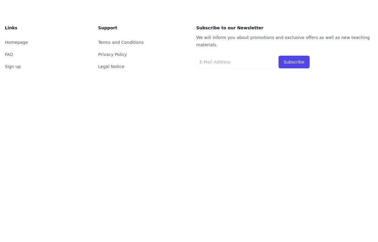
 Five columns with subscribe button
This example of tailwind css footer can be used if you want five columns in your footer with brand logo, sitemap links, description and social media account with additional subscibe button to connect with your website.
1 year ago2.7k -
 Footer with Member info
Use below footer tailwind template which show number of member who joins the community.
1 year ago2.4k -
 Newsletter form with Pre-footer CTA
Get started with this example with a CTA section before the footer, a sitemap links, the logo of your brand, a newsletter sign-up form, and the copyright notice.
1 year ago2.7k -
 Animated Website
Welcome to our animated and engaging website built with Tailwind CSS. We provide top-notch web design, development, SEO, and consulting services to help your business grow.
10 months ago1.4k -
 Simple tailwind footer
Simple tailwind footer with newsletter
3 years ago10.5k -
 3 years ago9.6k
 -
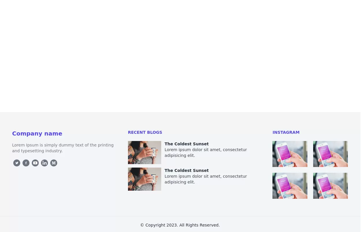
 Footer for blog
https://github.com/tailwindow/component
3 years ago18.7k


Explore components by Tags
Didn't find component you were looking for?
Search from 3000+ components