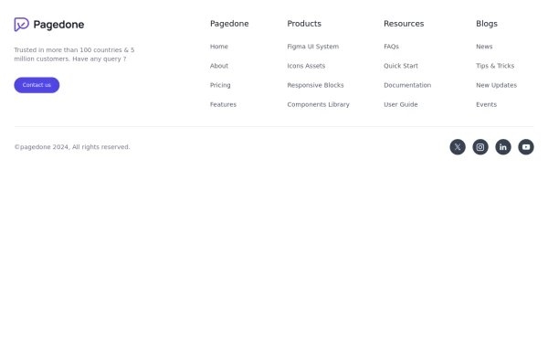
Standard footer
You can use this example for five column footer with social media accounts, sitemap links, copyright notice and brand logo.
This tailwind example is contributed by Pagedone, on 02-May-2024. Component is made with Tailwind CSS v3. It is responsive.

Author Pagedone
Related Examples
-
 3 years ago12.5k
 -
 Modern Dark Footer with Overlapping Gradient CTA
A comprehensive, dark-themed website footer component built with HTML and Tailwind CSS. It features a visually distinct overlapping section with a colorful gradient background containing a prominent call-to-action (CTA) block. The main footer area utilizes a multi-column grid layout for organized navigation links, a newsletter signup form, and social media icons. A final bottom bar includes legal links and copyright information. The design is responsive and adapts its layout for different screen sizes.
10 months ago1.1k -
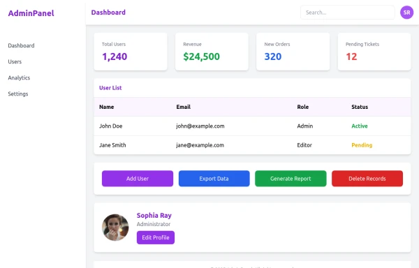 admin panel UI
Premium Admin Panel Pack including sidebar navigation, top navbar, dashboard cards, user tables, quick actions, profile section, and footer. Fully responsive with modern clean design using Tailwind CSS.
8 months ago1.9k -
 Footer for blog
https://github.com/tailwindow/component
3 years ago18.6k -
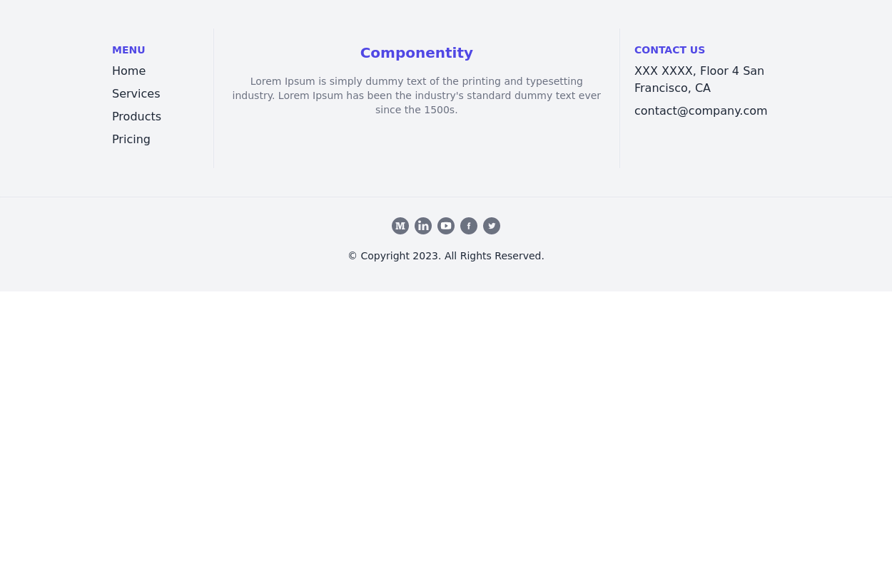
 Responsive footer
Footer section with icons
3 years ago12.6k -
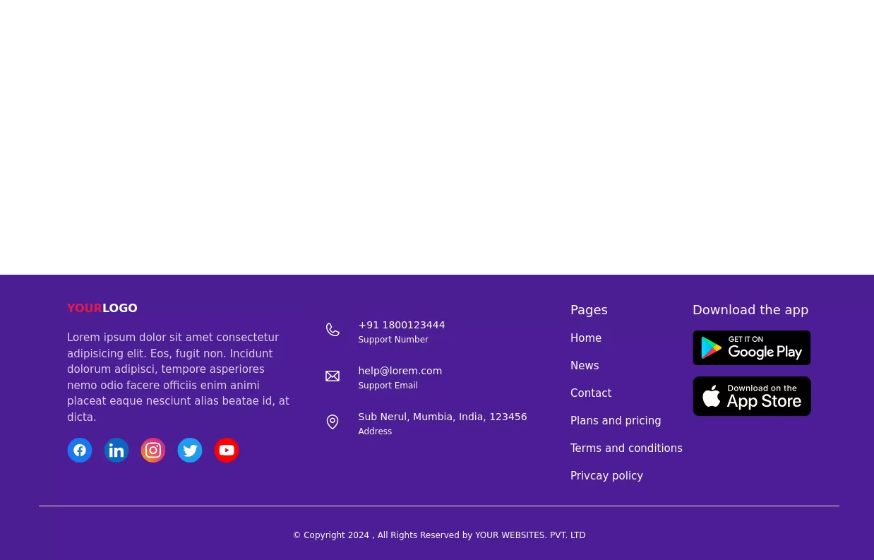
 Four columns with address location
You can use this Tailwind Footer example to first show address location of your company with brand logo next to sitemap links.
1 year ago2.8k -
 beautifull portfolio page
I create a portfolio page
1 year ago2.1k -
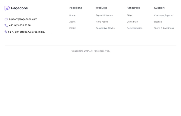
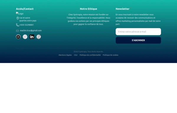
 Default Tailwind Footer
Use this example of a footer section divided in five columns with brand logo, desciption, sitemap links and social media accounts.
1 year ago3k -
 3 years ago13.3k
 -
 Footer version Ousmane
Ce footer est associer a un menu de navigation qui apparait sous le mobile donc avec sa plus besoin de gerer les menus sous le mobile.
4 months ago261 -
 Footer
responsive footer
2 years ago8.8k -
 11 months ago1.2k


Explore components by Tags
Didn't find component you were looking for?
Search from 3000+ components