Footer
Footer with responsive desing
This tailwind example is contributed by Rajesh Maheshwari, on 28-Feb-2025. Component is made with Tailwind CSS v3. It is responsive.

Author Rajesh Maheshwari
Related Examples
-
 Call to Action (for app stores)
Download app section with Playstore and Appstore button
3 years ago11.5k -
 Animated Website
Welcome to our animated and engaging website built with Tailwind CSS. We provide top-notch web design, development, SEO, and consulting services to help your business grow.
7 months ago1.1k -
 9 months ago1.1k
 -
 Simple centered footer
Use this example for simple footer with horizontal sitemap links, brand logo, and social media accounts.This example can also be used as a tailwind sticky footer.
1 year ago2.8k -
 Newsletter with address location
Use this example to first show brand logo card, then show address locations of your company, a newsletter sign-up form.
1 year ago2.8k -
 Tailwind Footer Template
Following is the Tailwind CSS template for creative footer with contact information like address, email, phone number and a newsletter with social icons and site links.
1 year ago3k -
 1 year ago2k
 -
 Newsletter form with Pre-footer CTA
Get started with this example with a CTA section before the footer, a sitemap links, the logo of your brand, a newsletter sign-up form, and the copyright notice.
1 year ago2.5k -
 home page
Hero Section: Gradient background with noise texture Animated floating image Gradient text effect Call-to-action buttons Features Section: Three feature cards with gradient headers Hover animations Clean iconography Stats Display: Full-width gradient background Clean stat presentation Testimonials: Three testimonial cards with user avatars Star ratings Border accents Hover scaling effects Call-to-Action (CTA) Section: Gradient background Centered content Multiple action buttons Footer: Four-column layout Social media icons Newsletter signup Copyright information Design Features: Vibrant gradient color scheme Smooth hover animations and transitions Responsive layout for all screen sizes Modern typography Subtle floating animations Clean, card-based design
7 months ago927 -
 2 years ago5.2k
 -
 Footer
A footer is a critical part of any professional website. A footer ensures your website is complete, professional, user-friendly, and legally compliant. It's where users go for answers when they're done scrolling.
6 months ago963 -
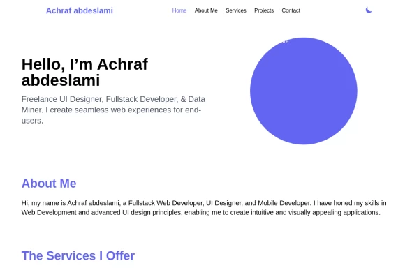 Responsive portfolio with dark mode
responsive and support dark mode .portfolio website
1 year ago3.6k


Explore components by Tags
Didn't find component you were looking for?
Search from 3000+ components