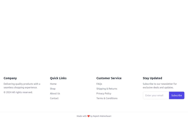
Crafting a Responsive Footer with TypeScript, and Tailwind CSS
This is a well-structured and comprehensive footer section that uses Tailwind CSS for styling and layout. Here’s a brief explanation of what each part does:
Footer Container (<footer class="bg-gray-800">):
The footer is wrapped in a <footer> element with a dark background using the bg-gray-800 class.
The aria-labelledby="footer-heading" attribute is used for accessibility, linking the <footer> to the invisible heading (<h2 id="footer-heading" class="sr-only">Footer</h2>).
Main Content Area:
The content inside the footer is centered and spaced using utility classes like max-w-7xl mx-auto py-12 px-4 sm:px-6 lg:py-16 lg:px-8.
Footer Sections:
The footer is divided into several sections using grid layouts (xl:grid xl:grid-cols-5 xl:gap-8), which organize content into columns.
Each section (Solutions, Support, Company, Legal) contains a heading with a list of links. These links are styled with Tailwind classes for consistent spacing and hover effects (text-base text-gray-300 hover:text-white).
Language & Currency Selector:
This section provides dropdowns for selecting language and currency. Tailwind's form utilities (@tailwindcss/forms plugin) are used to style the select elements.
Newsletter Subscription Form:
A subscription form is provided with an email input and a submit button. The form is styled to be responsive, with focus states for accessibility (focus:ring-2 focus:ring-offset-2).
Social Media Links:
Social media icons (Facebook, Instagram, etc.) are included, each wrapped in a link with hover effects. Icons are created using SVGs, which are scalable and look sharp at any size.
Final Section:
The footer concludes with another grid layout, ensuring spacing and alignment for different screen sizes.
Customization Tips:
Colors: You can easily customize the colors using Tailwind's utility classes (e.g., bg-gray-800, text-gray-400) to match your design.
Icons: Replace SVGs with the appropriate icons for your needs. You might use a different icon set or add more icons.
Responsive Design: Tailwind's utility classes like sm:, md:, lg:, xl: ensure that the footer is responsive across devices. Adjust the layout or padding if needed.
Additional Considerations:
SEO: Ensure the links in the footer point to meaningful pages to improve SEO.
Accessibility: Consider adding aria-labels to the form elements and social media links to enhance accessibility further.
This footer is ready to be integrated into a Tailwind CSS-powered project, offering both aesthetic appeal and functional utility.
This tailwind example is contributed by zobaidul kaziex, on 27-Aug-2024. Component is made with Tailwind CSS v3. It is responsive. It supports dark mode.

Author zobaidul kaziex
Related Examples
-
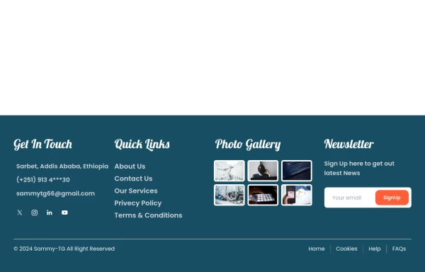
 Tailwind Footer Template
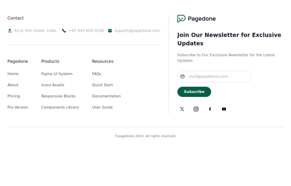
Following is the Tailwind CSS template for creative footer with contact information like address, email, phone number and a newsletter with social icons and site links.
1 year ago3k -
 3 years ago13.6k
 -
 Footer
A footer is a critical part of any professional website. A footer ensures your website is complete, professional, user-friendly, and legally compliant. It's where users go for answers when they're done scrolling.
8 months ago1k -
 subscribe form in Footer
You can use following subscribe form in your tailwind footer section beside contact information such as email address, phone numbers etc and You can also shows community counts.
1 year ago3.1k -
 Footer
Footer with responsive desing
1 year ago1.4k -
 1 year ago2.1k
 -
 home page
Hero Section: Gradient background with noise texture Animated floating image Gradient text effect Call-to-action buttons Features Section: Three feature cards with gradient headers Hover animations Clean iconography Stats Display: Full-width gradient background Clean stat presentation Testimonials: Three testimonial cards with user avatars Star ratings Border accents Hover scaling effects Call-to-Action (CTA) Section: Gradient background Centered content Multiple action buttons Footer: Four-column layout Social media icons Newsletter signup Copyright information Design Features: Vibrant gradient color scheme Smooth hover animations and transitions Responsive layout for all screen sizes Modern typography Subtle floating animations Clean, card-based design
9 months ago1.1k -
 Footer with gallery
Use this example if you want to add gallery of images into your footer with brand logo, sitemap links and copyright notice.
1 year ago2.6k -
 1 year ago2.7k
 -
 Call to Action (for app stores)
Download app section with Playstore and Appstore button
3 years ago11.8k -
 Premium High-Performance Web Gaming Hub
Experience the future of browser-based gaming. I’ve developed a premium arcade hub designed for speed, clarity, and zero-latency gameplay. Built with modern web technologies, Ayyamperumal Games brings AAA-inspired visuals and high-octane mechanics directly to your browser—no downloads, no lag, just pure performance. Explore a curated library of titles ranging from minimalist logic puzzles like Sudoku Elite to fast-paced action in Neon Drift. This is where clean code meets high-level entertainment.
2 months ago407 -
 Responsive portfolio with dark mode
responsive and support dark mode .portfolio website
1 year ago3.9k


Explore components by Tags
Didn't find component you were looking for?
Search from 3000+ components