
Impact
-
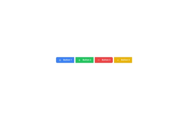 Button group involves using utility classes
Background colors, hover effects, and animations to the button group using only Tailwind CSS
1 year ago1.3k -
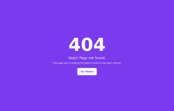 404 page with a purple background
Here's an updated version of the 404 page with a purple background
1 year ago1.7k -
 Testimonial examples in Tailwind CSS
Here are some testimonial section examples using Tailwind CSS:
1 year ago1.5k -
 Designing a Responsive Form Layouts with Tailwind CSS
Enhance your web application by building a sleek and responsive Form Layouts using Tailwind CSS. This comprehensive guide walks you through creating an interactive Form Layouts section featuring.
1 year ago3k -
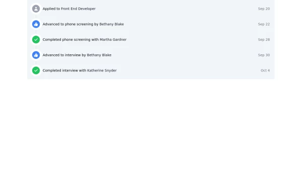 Designing a Responsive Activity Feed with Tailwind CSS
Enhance your web application by building a sleek and responsive activity feed using Tailwind CSS. This comprehensive guide walks you through creating an interactive feed section featuring customizable icons, links, and timestamps. Learn how to implement a visually appealing and accessible timeline that adapts seamlessly to any device, improving user engagement and overall experience
1 year ago2.7k -
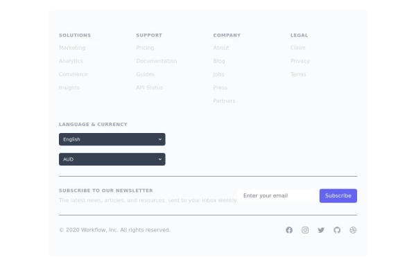 Crafting a Responsive Footer with TypeScript, and Tailwind CSS
This is a well-structured and comprehensive footer section that uses Tailwind CSS for styling and layout. Here’s a brief explanation of what each part does: Footer Container (<footer class="bg-gray-800">): The footer is wrapped in a <footer> element with a dark background using the bg-gray-800 class. The aria-labelledby="footer-heading" attribute is used for accessibility, linking the <footer> to the invisible heading (<h2 id="footer-heading" class="sr-only">Footer</h2>). Main Content Area: The content inside the footer is centered and spaced using utility classes like max-w-7xl mx-auto py-12 px-4 sm:px-6 lg:py-16 lg:px-8. Footer Sections: The footer is divided into several sections using grid layouts (xl:grid xl:grid-cols-5 xl:gap-8), which organize content into columns. Each section (Solutions, Support, Company, Legal) contains a heading with a list of links. These links are styled with Tailwind classes for consistent spacing and hover effects (text-base text-gray-300 hover:text-white). Language & Currency Selector: This section provides dropdowns for selecting language and currency. Tailwind's form utilities (@tailwindcss/forms plugin) are used to style the select elements. Newsletter Subscription Form: A subscription form is provided with an email input and a submit button. The form is styled to be responsive, with focus states for accessibility (focus:ring-2 focus:ring-offset-2). Social Media Links: Social media icons (Facebook, Instagram, etc.) are included, each wrapped in a link with hover effects. Icons are created using SVGs, which are scalable and look sharp at any size. Final Section: The footer concludes with another grid layout, ensuring spacing and alignment for different screen sizes. Customization Tips: Colors: You can easily customize the colors using Tailwind's utility classes (e.g., bg-gray-800, text-gray-400) to match your design. Icons: Replace SVGs with the appropriate icons for your needs. You might use a different icon set or add more icons. Responsive Design: Tailwind's utility classes like sm:, md:, lg:, xl: ensure that the footer is responsive across devices. Adjust the layout or padding if needed. Additional Considerations: SEO: Ensure the links in the footer point to meaningful pages to improve SEO. Accessibility: Consider adding aria-labels to the form elements and social media links to enhance accessibility further. This footer is ready to be integrated into a Tailwind CSS-powered project, offering both aesthetic appeal and functional utility.
1 year ago3.1k -
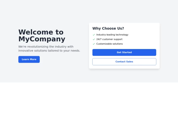 Responsive Hero Section
Key features of this hero section: 1. Responsive layout: Uses a column layout on mobile and switches to a row layout on medium screens and larger. 2. Left side: - Company name as a large heading - Brief description - "Learn More" button 3. Right side: - "Why Choose Us?" section with bullet points - Two call-to-action buttons: "Get Started" and "Contact Sales" 4. Styling: - Uses Tailwind's utility classes for responsive design, colors, spacing, and typography - Incorporates a shadow and rounded corners for the right-side content box - Includes hover effects on buttons for better interactivity This hero section will be fully responsive: - On mobile devices, it will stack vertically with the company info on top and the details below. - On larger screens, it will display in a two-column layout. The use of Tailwind CSS classes ensures that the design is consistent and easily adjustable. You can further customize the colors, fonts, and spacing to match your brand's specific design guidelines. Would you like me to explain any part of this code or make any adjustments?
1 year ago2.8k -
 Production-Ready Responsive Navigation
This is a sample content area. Scroll down to see the fixed header in action.
1 year ago3.7k -
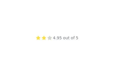 Rating with text
you also want to show a text near the stars you can use this example as a reference. @zobaidulkazi
1 year ago1.8k -
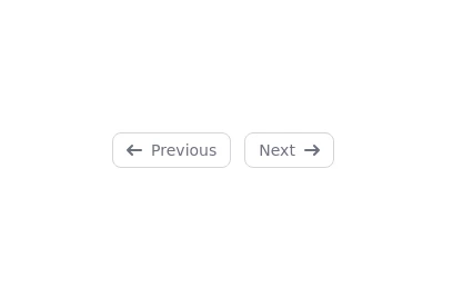 Previous and next with icons
Use the following code to show simple previous and next elements with icons. @zobaidulkazi
1 year ago2.6k -
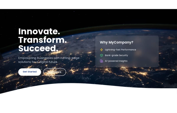 Hero Section>> visually striking and incorporates some different elements.
Key features of this alternative hero section: 1. Background: - Uses a gradient overlay on top of a background image for depth. - Incorporates a semi-transparent dark overlay for better text contrast. 2. Layout: - Maintains a two-column layout on larger screens, stacking on mobile. - Left side focuses on a bold, three-line tagline and concise description. - Right side features a glassmorphic card with key selling points. 3. Design Elements: - Uses a custom Google Font (Poppins) for a modern look. - Incorporates rounded buttons with hover effects. - Features colorful icons for the selling points. - Adds a decorative wave SVG at the bottom for visual interest. 4. Responsiveness: - Adjusts padding, font sizes, and layout for different screen sizes. - Stacks buttons vertically on very small screens. 5. Interactivity: - Includes hover effects on buttons and links. This design aims to create a more visually impactful first impression while still maintaining clarity and focus on the key messages and call-to-action elements. The use of a background image with overlays adds depth, while the glassmorphic card on the right adds a modern touch. You can further customize this by: - Changing the background image URL to one that fits your brand. - Adjusting colors in the gradient, buttons, and icons to match your brand colors. - Modifying the tagline, description, and selling points to fit your company's message. Would you like me to explain any part of this code or make any further adjustments?
1 year ago5.4k -
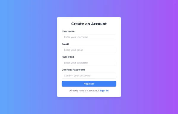 Responsive Registration Page
I created a responsive and visually appealing registration page using TailwindCSS and HTML5. This page features a gradient background, a modern card-style form, and clear input fields for username, email, password, and password confirmation. It includes client-side validation with real-time error messages to ensure all required fields are filled correctly and passwords match. This form is designed to provide a seamless user experience across all devices.
1 year ago3.3k