Dark Footer with newsletter
Use Following Footer for dark vsersion of your website with newsletter, social icons and site links.
This tailwind example is contributed by Pagedone, on 02-May-2024. Component is made with Tailwind CSS v3. It is responsive.

Author Pagedone
Related Examples
-
 3 years ago9.6k
 -
 Modern Responsive Footer with Tailwind CSS
This sleek and modern responsive footer is built using HTML and Tailwind CSS. It features three sections: brand information, useful links, and social media icons. The footer includes smooth hover effects, subtle fade-in animations, and a fully responsive design that adapts seamlessly to different screen sizes. Perfect for websites looking for a professional and stylish footer section.
1 year ago2.2k -
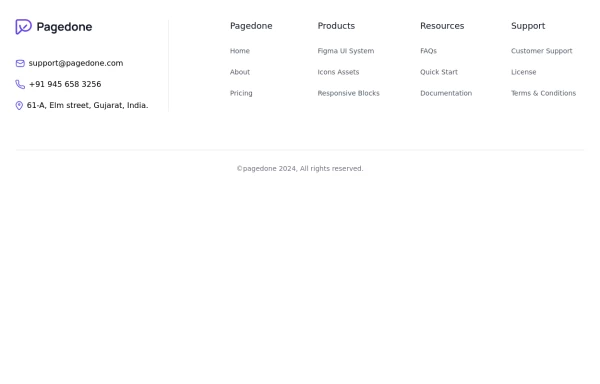
 Tailwind Footer with dark version
This example can be used if you are looking for four column footer in dark version with sitemap links, brand logo, and social media accounts.
1 year ago3.7k -
 Animated Website
Welcome to our animated and engaging website built with Tailwind CSS. We provide top-notch web design, development, SEO, and consulting services to help your business grow.
9 months ago1.3k -
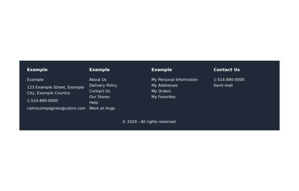
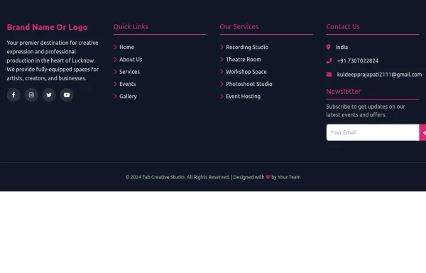
 Four columns with address location
You can use this Tailwind Footer example to first show address location of your company with brand logo next to sitemap links.
1 year ago2.8k -
 Standard footer
You can use this example for five column footer with social media accounts, sitemap links, copyright notice and brand logo.
1 year ago2.8k -
 footer
Footer with contact info, navigation, account links, and social media icons.
1 year ago3.3k -
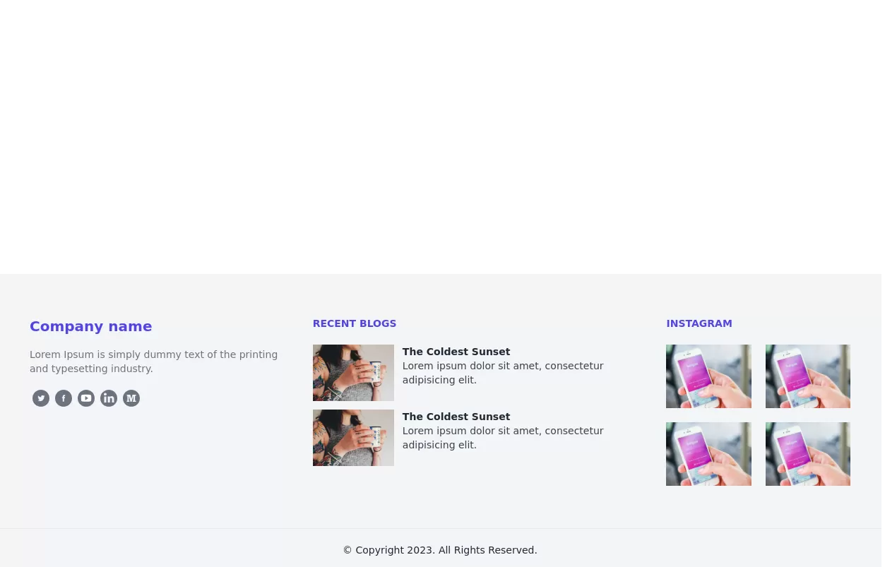
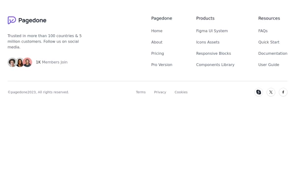 Footer with Member info
Use below footer tailwind template which show number of member who joins the community.
1 year ago2.4k -
 Footer
Simple Dark footer
8 months ago895 -
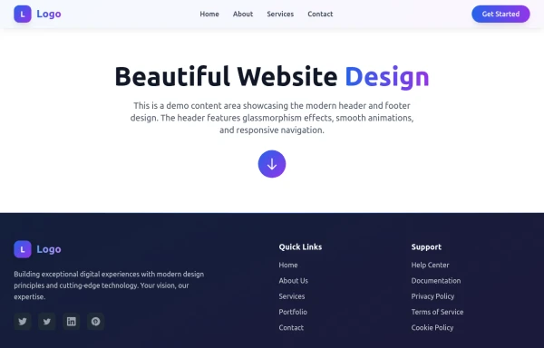 Modern Website Header & Footer
I created a professional header and footer using HTML and Tailwind CSS with modern design elements, smooth animations, and interactive features.
9 months ago1.6k -
 Footer
A footer is a critical part of any professional website. A footer ensures your website is complete, professional, user-friendly, and legally compliant. It's where users go for answers when they're done scrolling.
8 months ago1k -
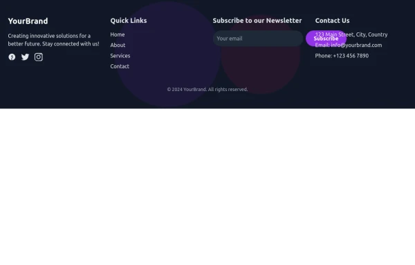
 Modern Dark Footer with Overlapping Gradient CTA
A comprehensive, dark-themed website footer component built with HTML and Tailwind CSS. It features a visually distinct overlapping section with a colorful gradient background containing a prominent call-to-action (CTA) block. The main footer area utilizes a multi-column grid layout for organized navigation links, a newsletter signup form, and social media icons. A final bottom bar includes legal links and copyright information. The design is responsive and adapts its layout for different screen sizes.
11 months ago1.1k


Explore components by Tags
Didn't find component you were looking for?
Search from 3000+ components