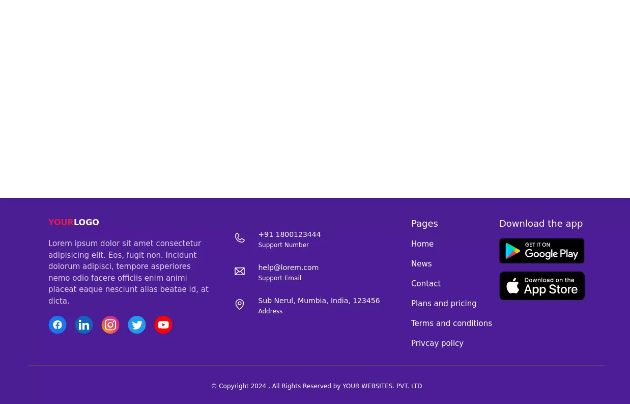
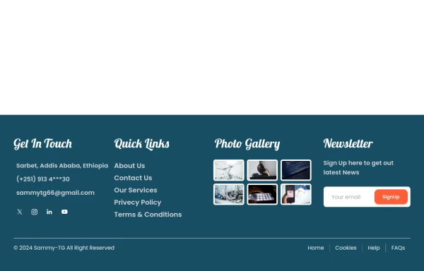
Default Tailwind Footer
Use this example of a footer section divided in five columns with brand logo, desciption, sitemap links and social media accounts.
This tailwind example is contributed by Pagedone, on 02-May-2024. Component is made with Tailwind CSS v3. It is responsive.

Author Pagedone
Related Examples
-
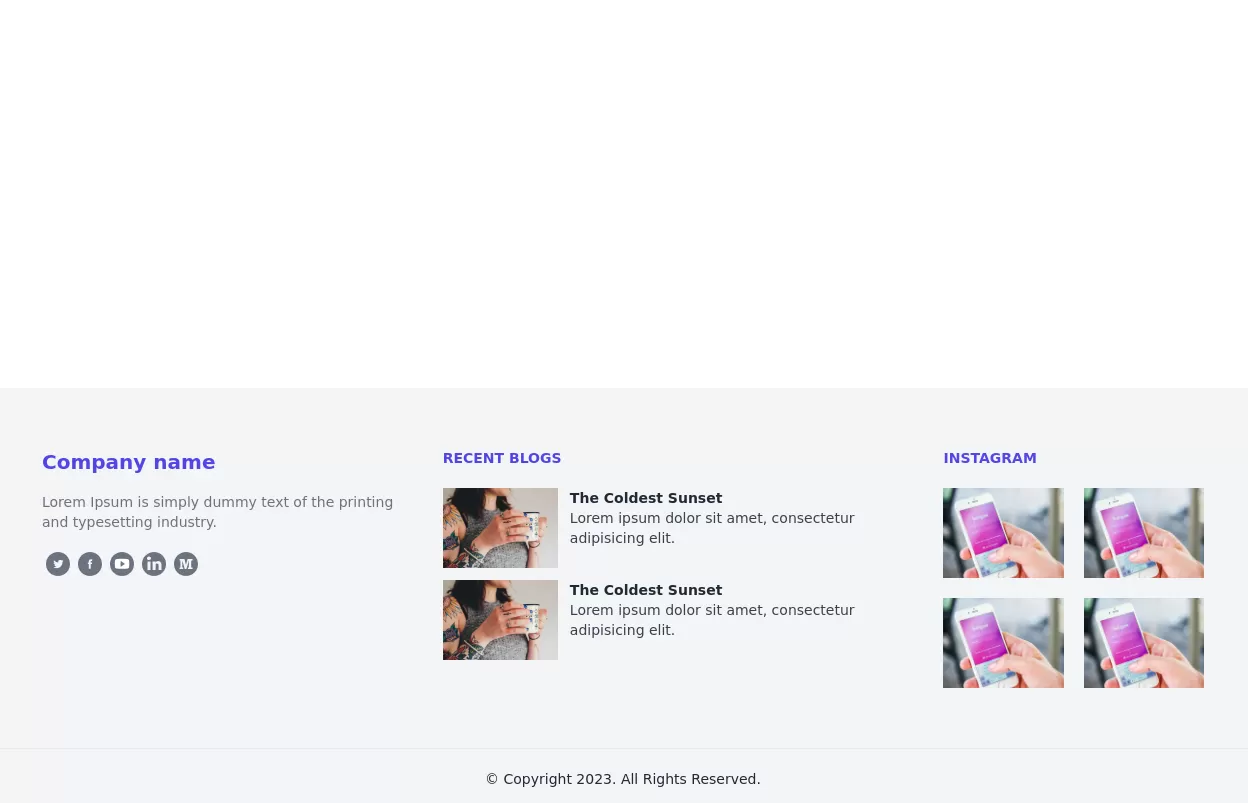
 Modern Responsive Footer with Tailwind CSS
This sleek and modern responsive footer is built using HTML and Tailwind CSS. It features three sections: brand information, useful links, and social media icons. The footer includes smooth hover effects, subtle fade-in animations, and a fully responsive design that adapts seamlessly to different screen sizes. Perfect for websites looking for a professional and stylish footer section.
11 months ago1.9k -
 3 years ago9.6k
 -
 2 years ago6.6k
 -
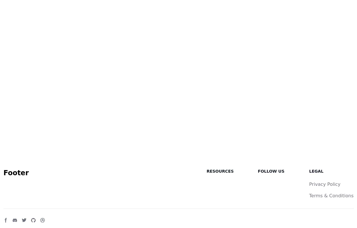
 Footer
responsive footer
1 year ago8.4k -
 Responsive portfolio with dark mode
responsive and support dark mode .portfolio website
1 year ago3.7k -
 1 year ago2.5k
 -
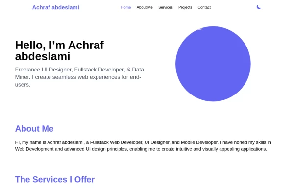
 Responsive Portfolio Webpage with Tailwind CSS
This is a reusable and responsive portfolio webpage template created with HTML and Tailwind CSS. Designed for developers or creatives, the template includes essential sections like Header, Hero, About, Skills, Experience, Projects, Testimonials, Contact Form, and Footer. It features a clean, modern design and is fully customizable without requiring JavaScript. Perfect for showcasing personal or professional work on the web.
11 months ago2.1k -
 1 year ago3.4k
 -
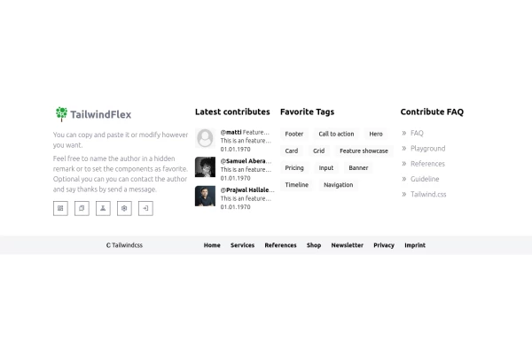 Footer, TailwindFlex v2
Another footer version of tailwindflex.com Example users randomly picked: Samuel & Prajwal
1 year ago1k -
 1 year ago2k
 -
 1 year ago1.7k
 -
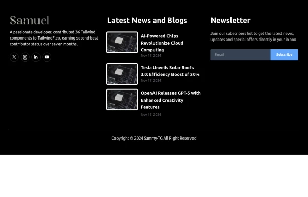
 beautifull web page
I create a web page using cloude ai its amazing.
1 year ago3k


Explore components by Tags
Didn't find component you were looking for?
Search from 3000+ components