Responsive footer
This tailwind example is contributed by Lukas Müller, on 13-Feb-2023. Component is made with Tailwind CSS v3. It is responsive.

Author Lukas Müller
Related Examples
-
 3 years ago16.1k
 -
 3 years ago16.6k
 -
 3 years ago10.9k
 -
 Responsive footer
Footer section with icons
3 years ago12.6k -
 Responsive Footer
source: https://kitwind.io/products/kometa/components/footers
3 years ago16.8k -
 3 years ago13.3k
 -
 1 year ago2k
 -
 Crafting a Responsive Footer with TypeScript, and Tailwind CSS
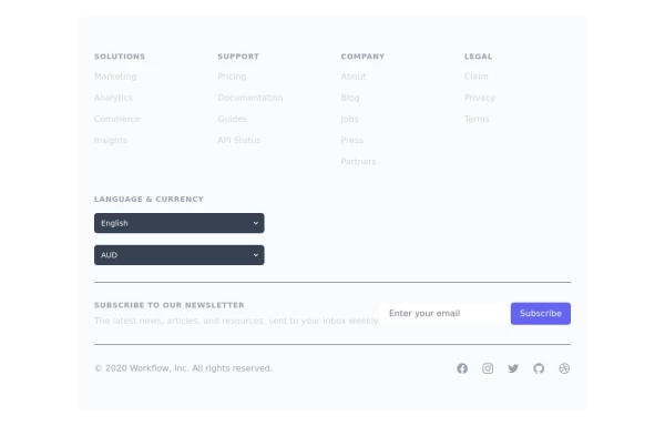
This is a well-structured and comprehensive footer section that uses Tailwind CSS for styling and layout. Here’s a brief explanation of what each part does: Footer Container (<footer class="bg-gray-800">): The footer is wrapped in a <footer> element with a dark background using the bg-gray-800 class. The aria-labelledby="footer-heading" attribute is used for accessibility, linking the <footer> to the invisible heading (<h2 id="footer-heading" class="sr-only">Footer</h2>). Main Content Area: The content inside the footer is centered and spaced using utility classes like max-w-7xl mx-auto py-12 px-4 sm:px-6 lg:py-16 lg:px-8. Footer Sections: The footer is divided into several sections using grid layouts (xl:grid xl:grid-cols-5 xl:gap-8), which organize content into columns. Each section (Solutions, Support, Company, Legal) contains a heading with a list of links. These links are styled with Tailwind classes for consistent spacing and hover effects (text-base text-gray-300 hover:text-white). Language & Currency Selector: This section provides dropdowns for selecting language and currency. Tailwind's form utilities (@tailwindcss/forms plugin) are used to style the select elements. Newsletter Subscription Form: A subscription form is provided with an email input and a submit button. The form is styled to be responsive, with focus states for accessibility (focus:ring-2 focus:ring-offset-2). Social Media Links: Social media icons (Facebook, Instagram, etc.) are included, each wrapped in a link with hover effects. Icons are created using SVGs, which are scalable and look sharp at any size. Final Section: The footer concludes with another grid layout, ensuring spacing and alignment for different screen sizes. Customization Tips: Colors: You can easily customize the colors using Tailwind's utility classes (e.g., bg-gray-800, text-gray-400) to match your design. Icons: Replace SVGs with the appropriate icons for your needs. You might use a different icon set or add more icons. Responsive Design: Tailwind's utility classes like sm:, md:, lg:, xl: ensure that the footer is responsive across devices. Adjust the layout or padding if needed. Additional Considerations: SEO: Ensure the links in the footer point to meaningful pages to improve SEO. Accessibility: Consider adding aria-labels to the form elements and social media links to enhance accessibility further. This footer is ready to be integrated into a Tailwind CSS-powered project, offering both aesthetic appeal and functional utility.
1 year ago3.1k -
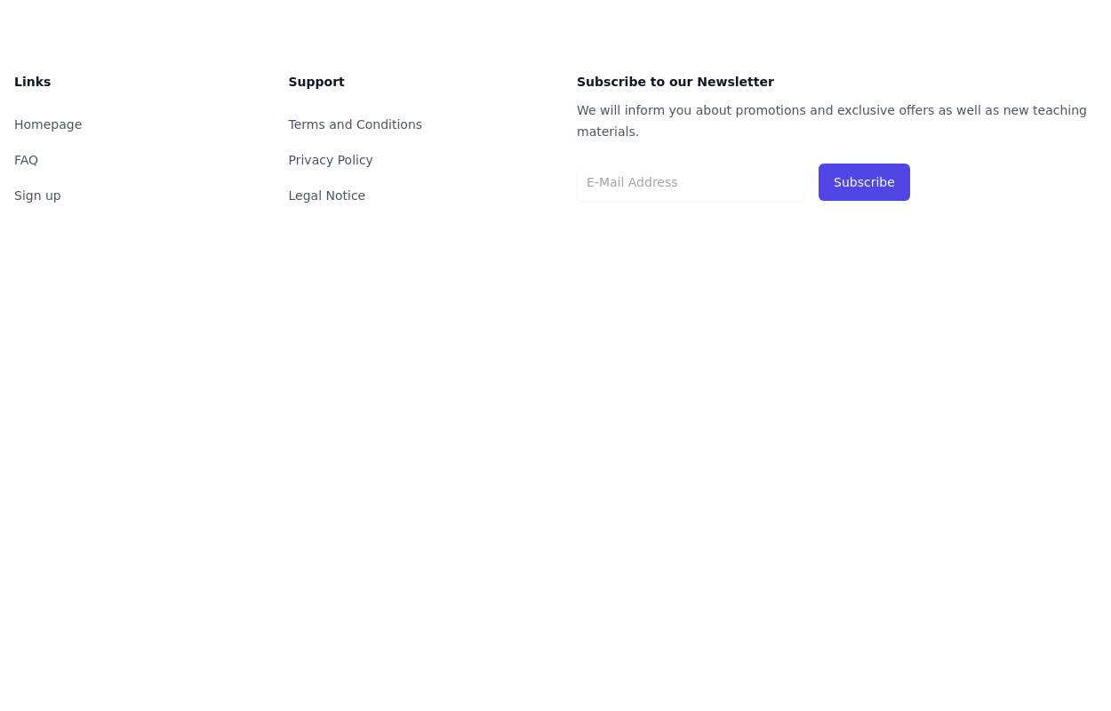 Simple tailwind footer
Simple tailwind footer with newsletter
3 years ago10.4k -
 Footer - Htmlwind
Simple centerd footer
9 months ago665 -
 Footer
A footer is a critical part of any professional website. A footer ensures your website is complete, professional, user-friendly, and legally compliant. It's where users go for answers when they're done scrolling.
8 months ago1k -
 NebulaFooter
Footer
11 months ago955


Explore components by Tags
Didn't find component you were looking for?
Search from 3000+ components