NOTIFICATION
This code can serve as a boiler-plate for a notification for an application
This tailwind example is contributed by NUNNA VIJAYA KRISHNA, on 10-Feb-2026. Component is made with Tailwind CSS v3. It is responsive. It supports dark mode. similar terms for this example are Toast, Snackbar

Author NUNNA VIJAYA KRISHNA
Related Examples
-
 3 years ago12.4k
 -
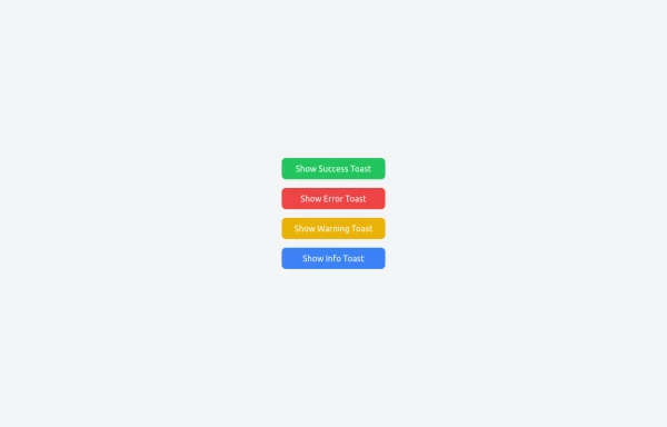 Notifications
Toast Notifications are lightweight and customizable components for displaying short messages or alerts. They are perfect for feedback on user actions, such as form submissions or system updates. Supports different types of notifications (success, error, warning, info). Automatically hides after a specified timeout. Option to include action buttons or close icons. Customizable styles, animation, and position on the screen.
1 year ago1.4k -
 joker
jokerjoker cyber punk
8 months ago1.2k -
 1 year ago1.5k
 -
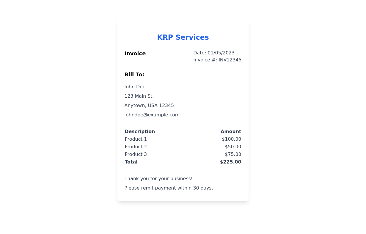
 DailyDev Card
Card -based card used in the Dailydev Card, this is created to be modified to taste of each user
1 year ago1.9k -
 3 years ago11.4k
 -
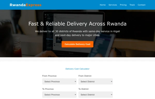 delivery
It will help us get our stuff delivered to your home in a way that your ordered items are delivered to your home.
9 months ago443 -
 2 years ago27.9k
 -
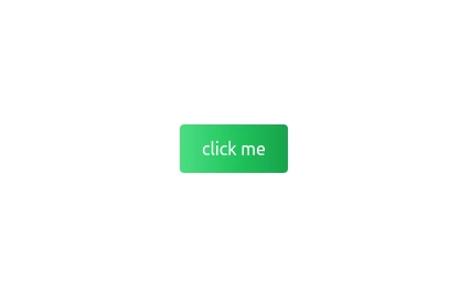 Gradient Flip-Text Button with Hover Animation
This stylish button features a dynamic gradient background that shifts from a calm green gradient by default to a vibrant purple-pink-red gradient on hover. The button also includes an interactive text flip effect, where the text seamlessly transitions on hover, creating a visually appealing and modern UI element. Perfect for adding flair to your websites or applications while maintaining functionality and responsiveness.
1 year ago1.4k -
 Chat template
fullscreen chat template suitable for mobile devices
3 years ago17.8k -
 3 years ago15.4k
 -
 2 years ago18.9k


Explore components by Tags
Didn't find component you were looking for?
Search from 3000+ components