Play, Pause and Stop buttons
This tailwind example is contributed by Lukas Müller, on 11-Jan-2023. Component is made with Tailwind v3.4.

Related Examples
-
-
Typewriter animation effect
Build using only Tailwind CSS; no JavaScript is required. This is a continuous typing effect. If you want to stop it after the text is typed for the first time, then you can remove 'infinite' from [typing: 'typing 2s steps(20) infinite alternate, blink .7s infinite'] from the config file.
22.1k -
background animation
background animation
53.2k -
 Lots of button examples
tailwind button examples
1.3k -
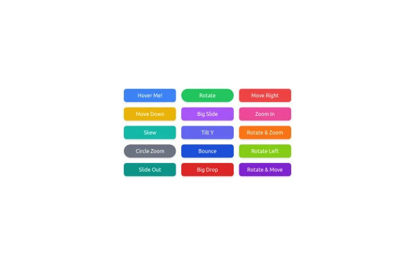 button animation
 big
1.6k -
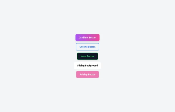 5 Different Style of Button
Gradient Button outline button neon button Sliding Background pulsing Button
1.2k -
 Tailwind CSS Blog sharing buttons with blog details
Introducing our Blog Sharing Buttons with Blog Details component, designed to enhance the social sharing experience on your blog posts.
2.4k -

-
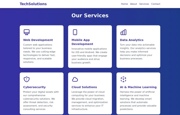 Services
This Services page design includes: 1. Responsive layout using Tailwind CSS grid system 2. Indigo-800 and Blue-900 color scheme 3. Dark mode support 4. Header with navigation 5. Six service cards with icons, titles, and descriptions 6. Footer with copyright information 7. Subtle animations and transitions 8. Accessibility considerations (proper heading structure, color contrast) Key features: - The background uses a gradient from Indigo-800 to Blue-900 - The header and footer have a white background in light mode and dark gray in dark mode - Service cards have a white background in light mode and dark gray in dark mode - Text colors are adjusted for readability in both light and dark modes - Icons use the Indigo-800 color (Indigo-400 in dark mode) for consistency - Each service card has a hover effect that scales it up slightly - Service cards fade in with a staggered delay for a smooth entrance - Dark mode is automatically applied based on system preferences - The design is fully responsive, adjusting from 1 to 3 columns based on screen size This design provides a clean, professional look for a services page while incorporating the requested color scheme and maintaining good usability across different devices and color modes.
2.9k -

-
 Product cards
 for eCommerce
1.4k -
 Clean Component Sharing Hub (Landing State)
A minimalist, "before-talking" landing screen designed for a code or design component sharing platform. Features a welcoming header, three distinct action cards for sharing/browsing/exporting code, and a floating input bar, all styled with soft shadows and ample white space mimicking modern design tools.
895






Browse by topic
Explore components by Tags
Jump straight to the UI pattern you need.
Can't find it?
Didn't find the component you were looking for?
Search across 3,000+ community-built components and grab the code in seconds.