Notifications
Toast Notifications are lightweight and customizable components for displaying short messages or alerts. They are perfect for feedback on user actions, such as form submissions or system updates.
Supports different types of notifications (success, error, warning, info).
Automatically hides after a specified timeout.
Option to include action buttons or close icons.
Customizable styles, animation, and position on the screen.
This tailwind example is contributed by Abhiraj, on 11-Jan-2025. Component is made with Tailwind v3.4. It is responsive. similar terms for this example are popup,dialog,caution,Toast, Snackbar

Related Examples
-
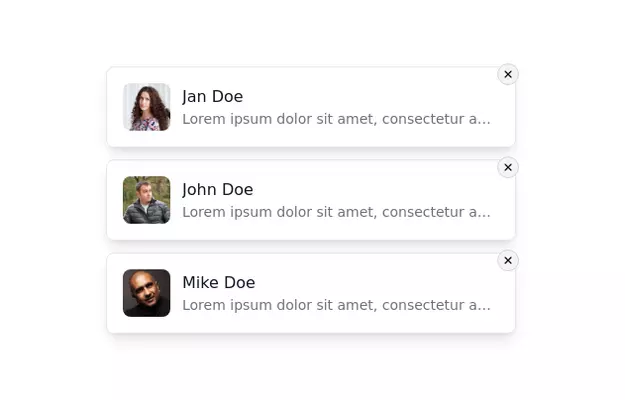 Notification Alert Section
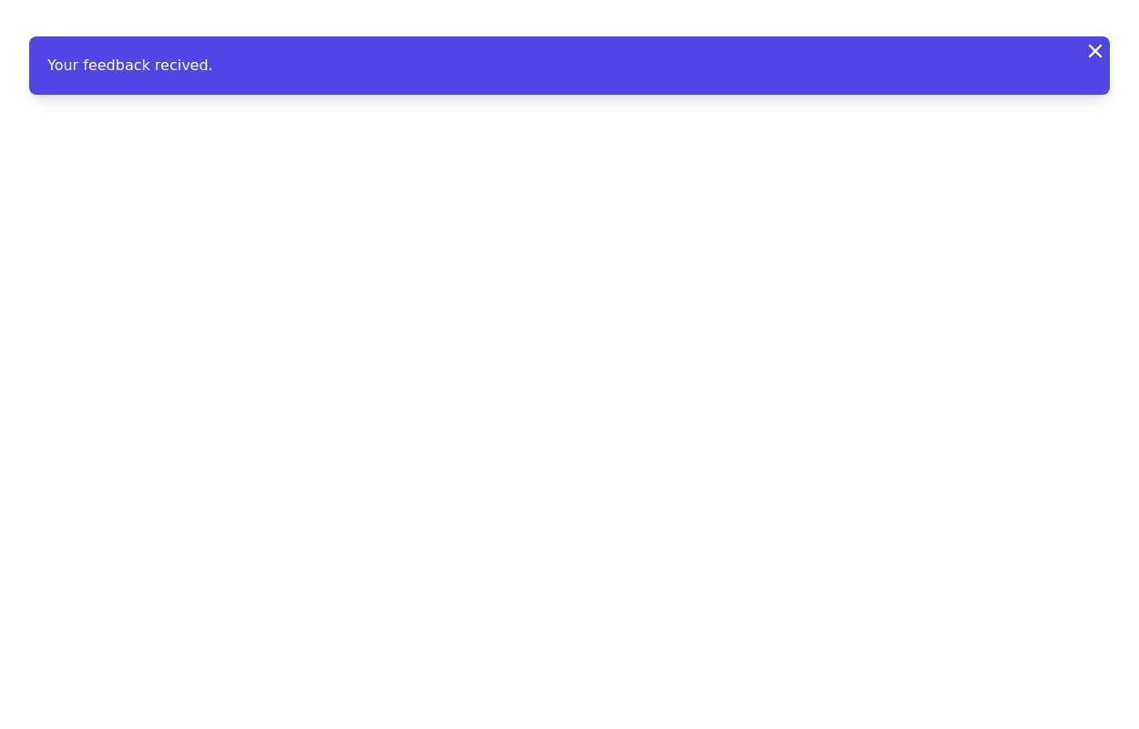
Notification card with close button
13.8k -
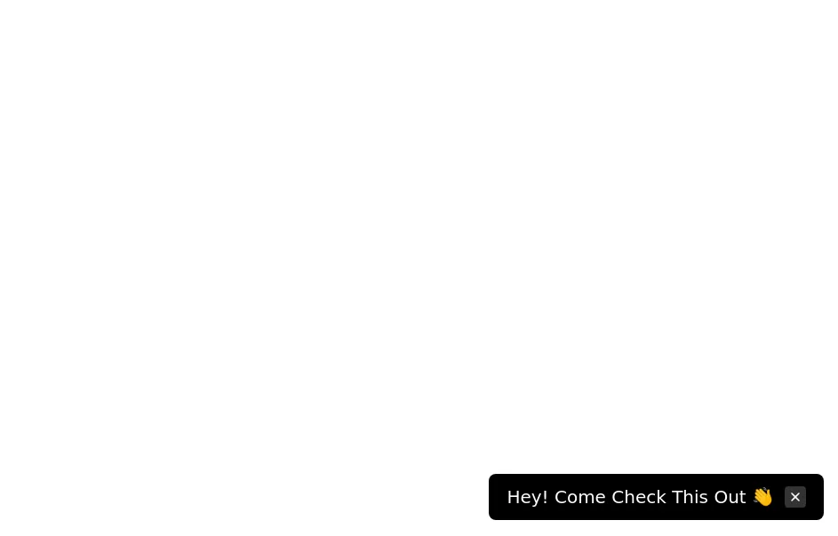 Floating dismissible notification
bottom right floating alert
14.4k -

-
 10.9k
10.9k -
 13.6k
13.6k -
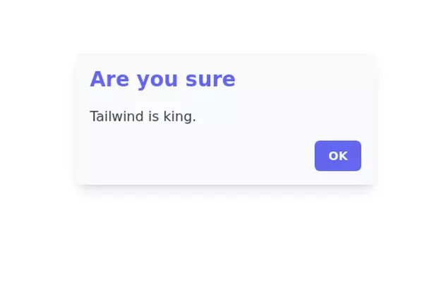
 Notification alert section
Show info, success, or error messages
11.5k -

-
-
-
-
-
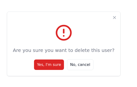
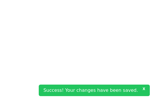 Closable toast message
show notification toast message at the bottom right corner
8.1k




Browse by topic
Explore components by Tags
Jump straight to the UI pattern you need.
Can't find it?
Didn't find the component you were looking for?
Search across 3,000+ community-built components and grab the code in seconds.