Share button
This tailwind example is contributed by Maxim, on 30-Dec-2024. Component is made with Tailwind CSS v3. It is responsive. similar terms for this example are Social media links,

Author Maxim
Related Examples
-
 visacardes
I'll create professional Visa card components with realistic styling and multiple card types
10 months ago791 -
 2 years ago11.5k
 -
 3 months ago426
 -
 1 year ago1.7k
 -
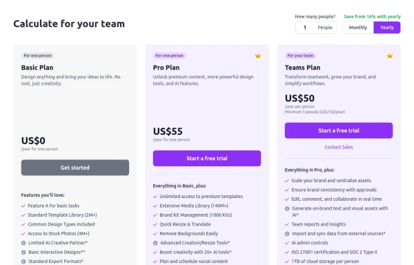 Configurable 3-Tier Responsive Pricing Table
A modern, responsive pricing table component inspired by SaaS layouts, built with HTML and Tailwind CSS. Features three distinct pricing tiers displayed in cards, stacking vertically on smaller screens and transitioning to a 3-column grid on large screens (lg breakpoint). Includes interactive top controls for selecting the number of users and toggling between monthly/yearly billing cycles. Each card uses placeholder content for icons, titles, descriptions, features (with checkmarks/info icons), and distinct call-to-action buttons, making it easily adaptable. Styled with subtle background colors and clear typography for excellent readability.
11 months ago874 -
 color blur
blur
1 year ago1.8k -
 Our features
Our features
1 year ago1.4k -
 Modern Responsive Footer with Tailwind CSS
This sleek and modern responsive footer is built using HTML and Tailwind CSS. It features three sections: brand information, useful links, and social media icons. The footer includes smooth hover effects, subtle fade-in animations, and a fully responsive design that adapts seamlessly to different screen sizes. Perfect for websites looking for a professional and stylish footer section.
1 year ago2.2k -
 templete
templete
9 months ago775 -
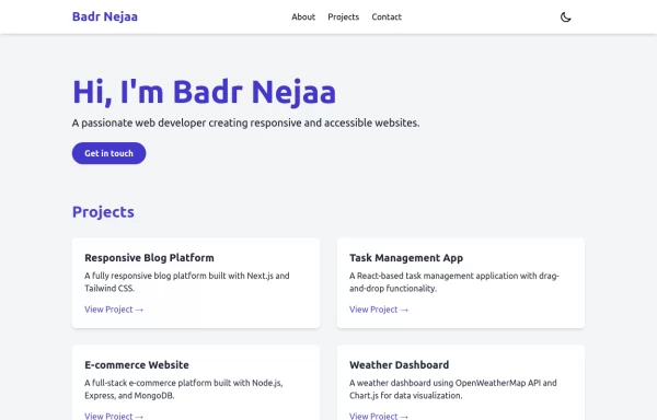 Portfolio
This responsive portfolio with dark mode support includes: 1. Fully responsive design that works on both desktop and mobile devices 2. Dark mode toggle with system preference detection and local storage persistence 3. Indigo-800 and Blue-900 color scheme for primary colors in light and dark modes 4. Beautiful animations and effects: 1. Fade-in and slide-up animations for sections using Intersection Observer 2. Hover effects on projects and buttons 3. Smooth scrolling for navigation 5. Mobile-friendly navigation with a toggle menu 6. Sections for About, Projects, and Contact 7. A contact form with styled inputs 8. Social media links in the footer 9. Accessibility considerations (proper heading structure, color contrast, focus styles, ARIA labels) Key features: - The color scheme uses Indigo-800 for light mode and orange-400 for dark mode as primary colors - Dark mode toggle in the header with a sun/moon icon - Sections fade in and slide up as they enter the viewport - Project cards have a hover effect with scaling and increased shadow - The contact form has animated focus states - Social media icons change color on hover - The layout is responsive, with a hamburger menu for mobile screens - Smooth scrolling behavior for navigation links - Dark mode preference is saved in local storage and syncs with system preference This implementation provides a visually appealing, accessible, and functional responsive portfolio with dark mode support, using HTML, Tailwind CSS, and vanilla JavaScript for the
1 year ago3.3k -
 Coffee & Tea
Coffee: A brewed drink prepared from roasted seeds, called coffee beans, of the coffee plant. Tea: An agricultural product of the leaves, leaf buds, and internodes of various cultivars and sub-varieties of the Camellia sinensis plant, processed and cured using various methods.
10 months ago1k -
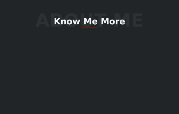 Text Overlay Effect
This is a text overlay effect, featuring a subtle background title and a prominent foreground heading. This design enhances visual interest while maintaining a clean, modern aesthetic.
1 year ago1.7k


Explore components by Tags
Didn't find component you were looking for?
Search from 3000+ components