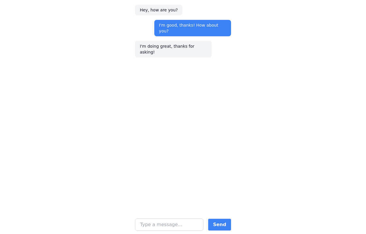
Chat template
fullscreen chat template suitable for mobile devices
This tailwind example is contributed by Manon Daniel, on 17-Feb-2023. Component is made with Tailwind CSS v3. It is responsive.

Author Manon Daniel
Related Examples
-
 3 years ago12.6k
 -
 Customer support chatbox
Floating chatbox
2 years ago11.7k -
background animation
background animation
2 years ago51k -
 2 years ago13.9k
 -
Typewriter animation effect
Build using only Tailwind CSS; no JavaScript is required. This is a continuous typing effect. If you want to stop it after the text is typed for the first time, then you can remove 'infinite' from [typing: 'typing 2s steps(20) infinite alternate, blink .7s infinite'] from the config file.
2 years ago21.3k -
 Question & Answer
questions and answers
2 years ago8.9k -
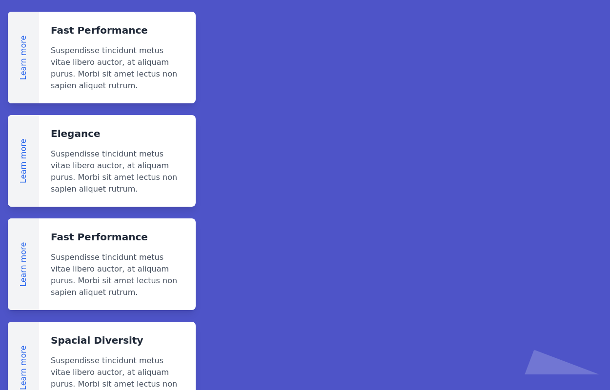 cards
cardscards with background animation
2 years ago11.4k -
 3 years ago19.2k
 -
 9 months ago345
 -
 Landi page template
con un cuerpo libre
2 months ago278 -
 Tailwind CSS Blog sharing buttons with blog details
Introducing our Blog Sharing Buttons with Blog Details component, designed to enhance the social sharing experience on your blog posts.
1 year ago2.1k -
 8 months ago701


Explore components by Tags
Didn't find component you were looking for?
Search from 3000+ components