40+ Free Notification examples in Tailwind CSS
A notification component is a user interface element that is used to inform the user of something, such as an error, warning, or confirmation message. These components are typically small and unobtrusive and are designed to appear and disappear quickly so as not to disrupt the user's workflow.
Notification components can be used to provide feedback to the user about the status of an action, such as the success or failure of a form submission, or to alert them to something that requires their attention, such as an incoming message or a reminder. Notification components are often used in conjunction with other UI elements, such as forms and buttons, to provide users with a clear and concise way to receive information and interact with the interface.
Similar terms: Toast, Snackbar
-
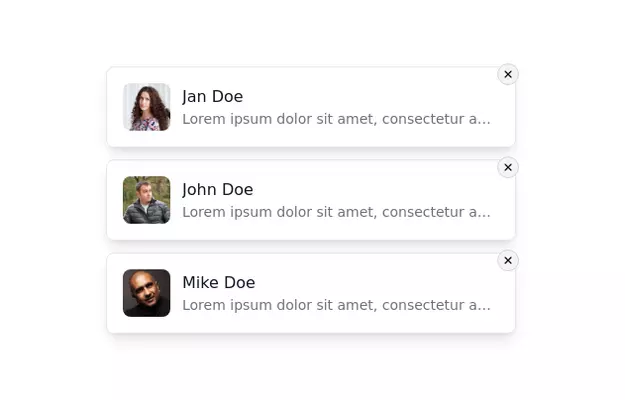 Notification Alert Section
Notification card with close button
3 years ago13.5k -
-
 3 years ago14.5k
 -
 3 years ago11.3k
 -
 Toast
Toastmensajes de alerta a los visitantes de su sitio web.
2 years ago16.1k -
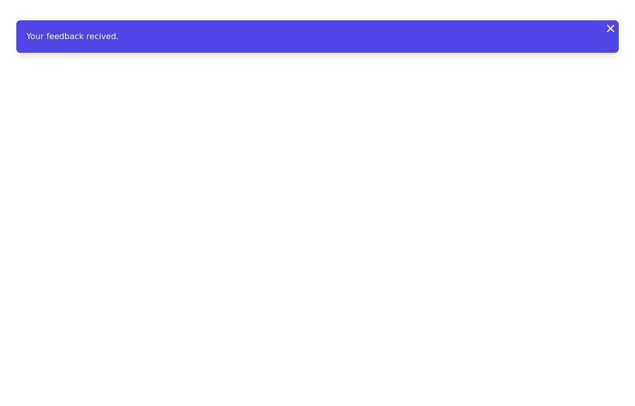
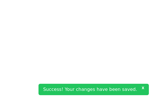 Closable toast message
show notification toast message at the bottom right corner
2 years ago8k -
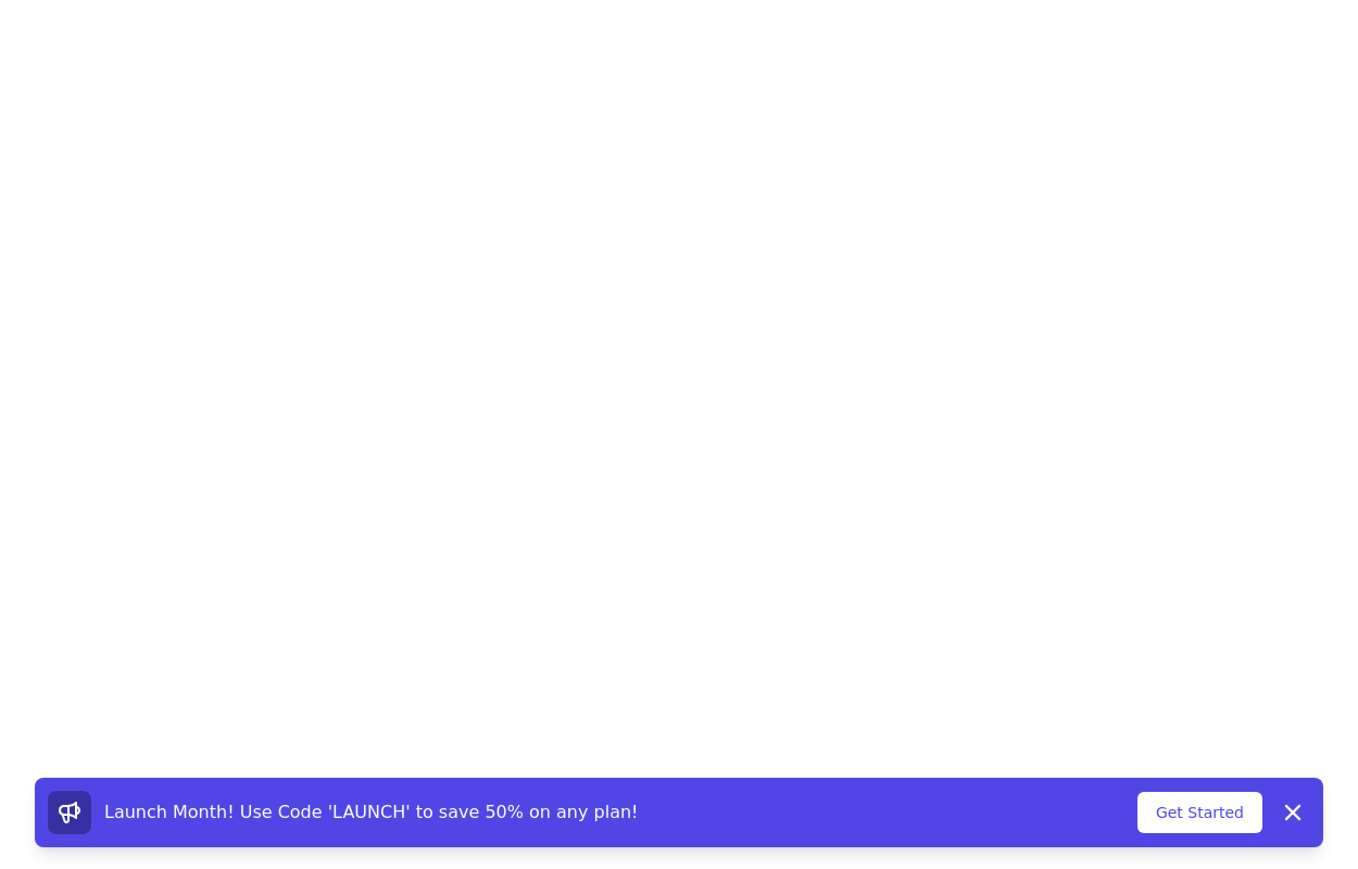 Promotional notification
sticky bottom promotional banner
3 years ago10.3k -
 3 years ago15.4k
 -
 3 years ago10.6k
 -
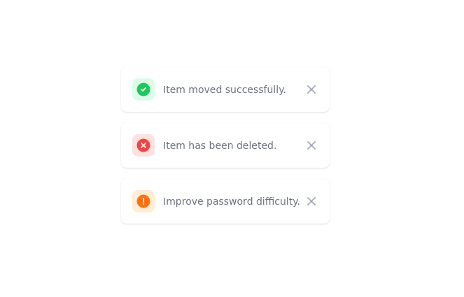
 Notification alert section
Show info, success, or error messages
3 years ago10.9k -
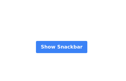 Snackbar with button
Show and close snackbar on button click with default timeout
2 years ago10.9k -
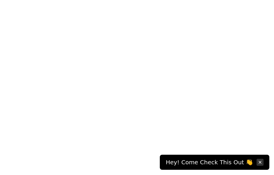 Floating dismissible notification
bottom right floating alert
3 years ago13.6k -
 3 years ago12.4k
 -
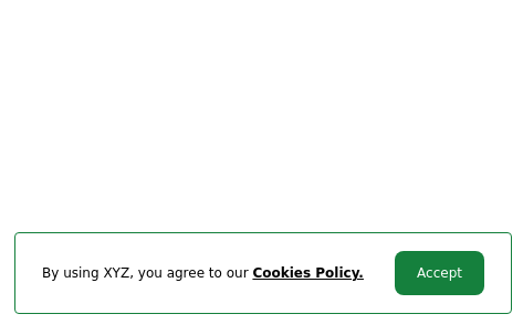 Cookie consent
Sticky Bottom Cookie Consent Notification
3 years ago10.9k -
 3 years ago10.1k


Didn't find component you were looking for?
Search from 3000+ components