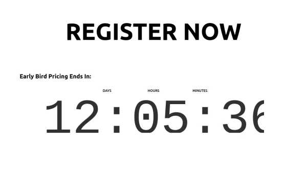
Modern CTA section
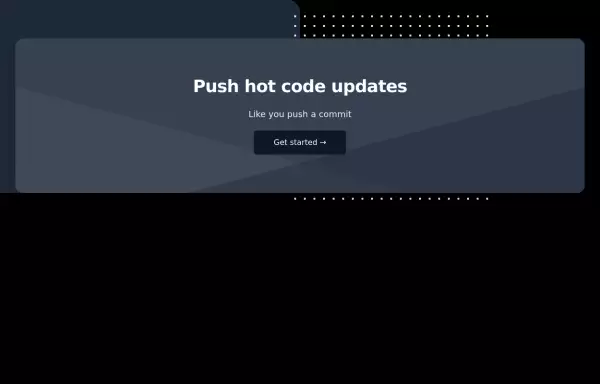
CTA with background patterns
This tailwind example is contributed by Nomthandazo Mhlongo, on 01-Apr-2024. Component is made with Tailwind CSS v3. It is responsive. It supports dark mode. similar terms for this example are CTA,banner

Author Nomthandazo Mhlongo
Related Examples
-
 3 years ago9.1k
 -
 3 years ago10.1k
 -
 3 years ago11.7k
 -
 10 months ago709
 -
 3 years ago12k
 -
 3 years ago10.8k
 -
-
 11 months ago1.5k
 -
 2 years ago12.9k
 -
 Hero Section
Responsive Hero Section for you Project Background Image: A stunning, high-quality Unsplash photo that creates a unique visual impact. Overlay: Semi-transparent black overlay with blur effect for readability and a modern aesthetic. Content Area: Centered with a gradient background overlay for contrast, bold headline, engaging subtext. Buttons: Vibrant gradient and clean border with smooth hover animations to draw attention. Responsive Design: Looks great on all screen sizes with adaptable padding and font sizes.
8 months ago1.5k -
 Animated Text Rotator | Smooth Tailwindcss Text Transition Effects
Beautiful animated text rotation component with smooth fade transitions. Perfect for hero sections, showcasing features, and engaging website visitors with dynamic content.
3 months ago233 -
 1 year ago2.7k


Explore components by Tags
Didn't find component you were looking for?
Search from 3000+ components