CTA block
This tailwind example is contributed by Samuel Dawson, on 16-Dec-2022. Component is made with Tailwind v3.4. It is responsive. similar terms for this example are CTA,banner

Related Examples
-

-
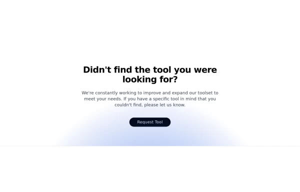 CTA section with light beam from bottom effect
It also has support for dark mode
2.5k -
 Modern CTA section
CTA banner
2.6k -
 Tilted button on hover.
A simple button with a gradient and tilt on hover. Dark mode supported with same color.
1.9k -
 12.5k
-
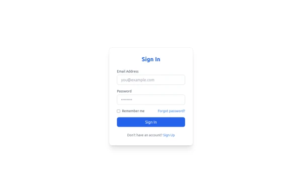 Sign In Form
Clean and modern Sign In form with email, password, and "Forgot password" link. Fully responsive and styled with Tailwind CSS, perfect for SaaS platforms.
1.3k -
 CTA Call To Action
CTA stands for "Call to Action." It is a marketing term that refers to prompts that encourage users to take a specific action. CTAs are typically found in websites, advertisements, emails, and various marketing materials. The goal of a CTA is to guide users toward a desired action that supports business objectives, such as: 1. Encouraging Engagement: A CTA may prompt users to sign up for a newsletter, follow on social media, or download a resource. 2. Driving Conversion: It can lead users to make a purchase, book a service, or start a free trial. 3. Generating Leads: A CTA might encourage users to fill out a form, requesting more information or a consultation.
1.2k -
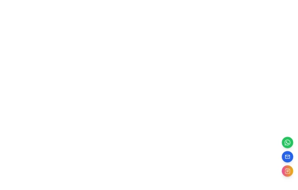 Floating Action Button
This component displays a fixed, floating contact button panel positioned at the bottom-right corner of the screen. It provides users with quick access to key communication channels including WhatsApp, Email, and Instagram. Each icon is styled with vibrant, platform-specific colors and includes subtle hover animations for an interactive user experience. Ideal for improving accessibility and encouraging user engagement, especially on mobile devices.
2.3k -

-
-
 10.6k
-







Browse by topic
Explore components by Tags
Jump straight to the UI pattern you need.
Can't find it?
Didn't find the component you were looking for?
Search across 3,000+ community-built components and grab the code in seconds.