Call-to-Action Card
Early Access Signup Card
This tailwind example is contributed by Santiago Hernandez, on 05-May-2024. Component is made with Tailwind CSS v3. It is responsive. similar terms for this example are CTA,banner

Author Santiago Hernandez
Related Examples
-
 2 years ago13.8k
 -
 3 years ago15.1k
 -
 CTA - Htmlwind
Screenshot on dark background
5 months ago379 -
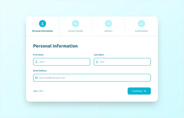 stepper
The Stepper Component is a versatile and user-friendly tool designed to guide users through a sequence of steps. Whether you're building a multi-step form, a tutorial, or any process that requires sequential navigation, this component makes it easy to implement and customize.
10 months ago1.5k -
 4 months ago370
 -
 Modern CTA section
CTA with background patterns
1 year ago2.4k -
 Join Our Community Banner
Encourage users to become members of a community.
2 years ago8.5k -
 2 years ago10k
 -
 The Future of Web Development
love my product
6 months ago787 -
 Landing page hero section UI
Modern Hero Section Design
1 month ago184 -
 Floating Action Button
This component displays a fixed, floating contact button panel positioned at the bottom-right corner of the screen. It provides users with quick access to key communication channels including WhatsApp, Email, and Instagram. Each icon is styled with vibrant, platform-specific colors and includes subtle hover animations for an interactive user experience. Ideal for improving accessibility and encouraging user engagement, especially on mobile devices.
7 months ago1.1k -
 Responsive CTA
Tailwind CTA card
1 year ago2.3k


Explore components by Tags
Didn't find component you were looking for?
Search from 3000+ components