Content showing for Call to action
This tailwind example is contributed by inbarajan P, on 05-Sep-2024. Component is made with Tailwind v3.4. It is responsive. similar terms for this example are CTA,banner

Related Examples
-
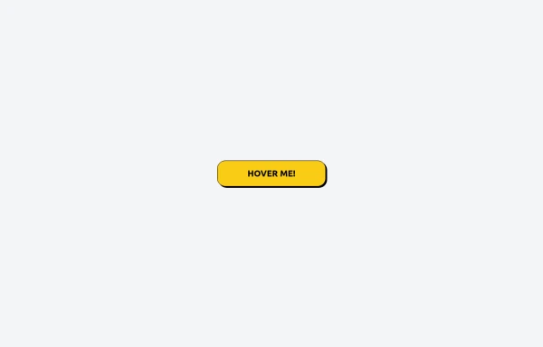 Tailwind CSS Button (Wavy Button)
The button uses Tailwind classes for size, background, border, border-radius, shadow, cursor, overflow, and transitions. The wave overlay is absolutely positioned at the bottom of the button, initially off-screen (top-full) and moves to the middle (top-1/2) on hover via the custom .wave class and keyframes. The font-poppins class isn’t a default Tailwind class. You should define it in your Tailwind configuration or replace it with font-sans if you haven't extended fonts.
1.3k -
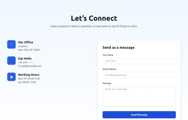 Modern Contact Section with Responsive Grid and Glassmorphic Form
A clean, professional contact section with a dual-column layout featuring contact details and a sleek glassmorphism-inspired form. Fully responsive with Tailwind CSS, supporting both light and dark modes.
-

-
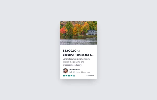 Card
Cardtravel place card hover effect card
2.4k -

-
-

-
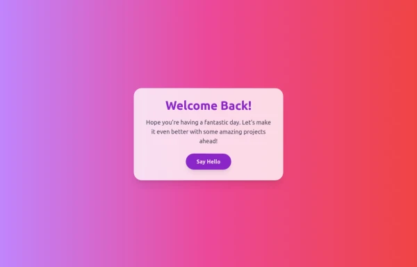 Boimator welcoming back
Boimator welcoming back
985 -
 Table CRUD
CRUD TABLE DESIGN
5k -

-
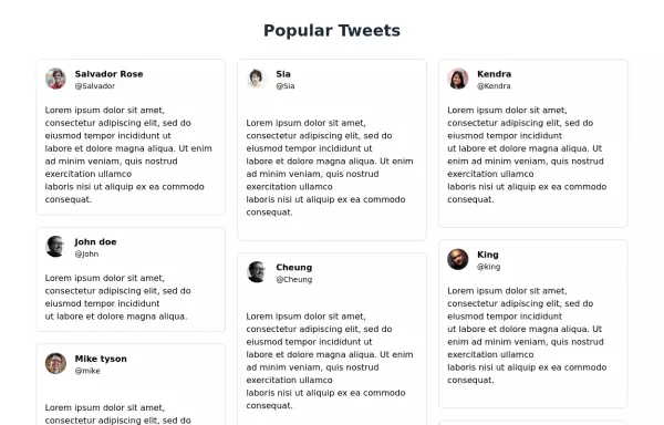 Tweets showcase grid
Responsive tweets showcase grid
11.5k -
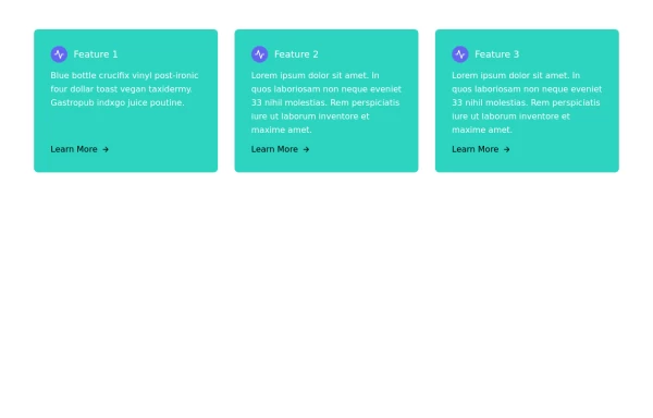 Responsive Card Grid
Tailwind CSS responsive grid for feature listing. The cards have a teal background, rounded corners, and a concise display of feature titles, descriptions, and a "Learn More" link.
2.7k









Browse by topic
Explore components by Tags
Jump straight to the UI pattern you need.
Can't find it?
Didn't find the component you were looking for?
Search across 3,000+ community-built components and grab the code in seconds.