call-to-action button
This tailwind example is contributed by Elijah Davis, on 01-Feb-2023. Component is made with Tailwind CSS v3. It is responsive. similar terms for this example are CTA,banner

Author Elijah Davis
Related Examples
-
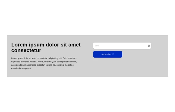 Call to action
CTA
1 year ago1.9k -
 3 years ago10k
 -
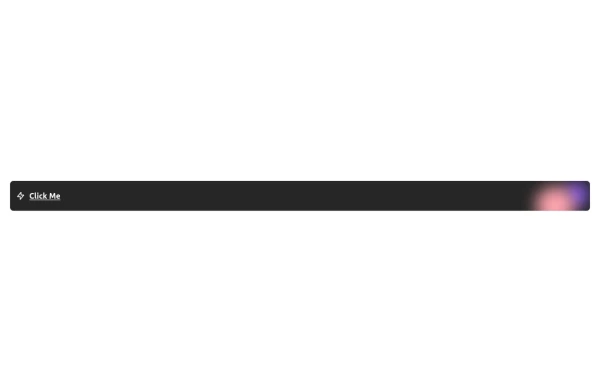 Free Animated Gradient Glow Button with Tailwind CSS
A modern, responsive Tailwind CSS button with glowing gradient hover effects, smooth animations, and an integrated SVG icon. Perfect for landing pages, call-to-action buttons, or any stylish UI project. Fully customizable and open source , ready to copy, paste, and use in your projects.
5 months ago382 -
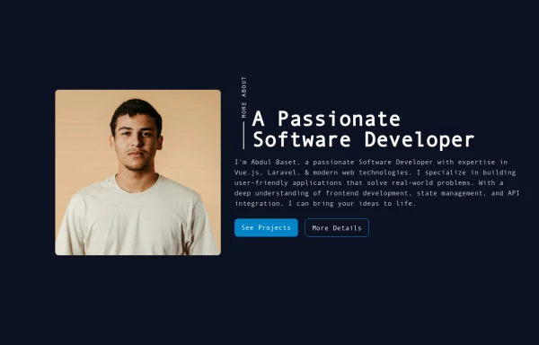 Responsive About Section with Tailwind CSS
Built a sleek and fully responsive About Section for my portfolio using Tailwind CSS! 🚀 Designed for smooth adaptability across all screen sizes with a modern and minimal aesthetic. Perfect for showcasing skills, experience, and a personal touch!
11 months ago1.6k -
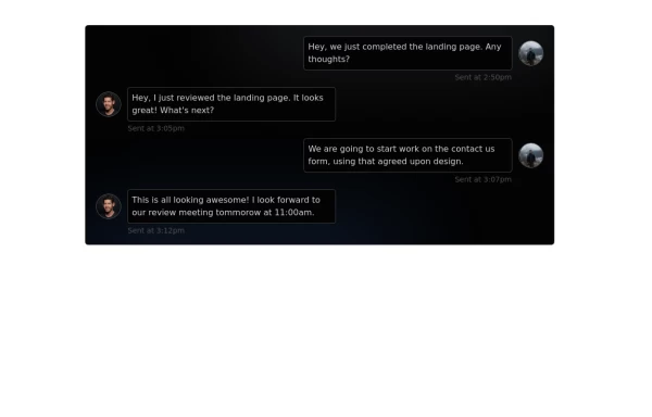 Chat Box for Marketing
An Onyx component. This chat box is great for SAAS landing pages where you want to mock customer interactions or expectations.
1 year ago2k -
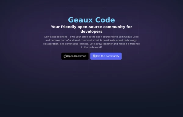 Geaux Code CTA Section
CTA with background patterns
1 year ago2k -
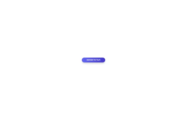 Tilted button on hover.
A simple button with a gradient and tilt on hover. Dark mode supported with same color.
11 months ago982 -
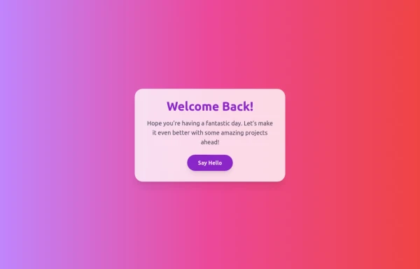 Boimator welcoming back
Boimator welcoming back
7 months ago522 -
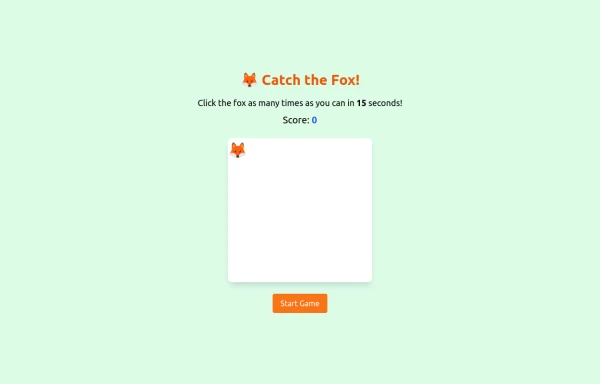 an off line game of catching afox
an off line game of catching afox
9 months ago787 -
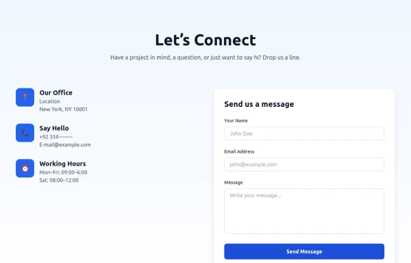 Modern Contact Section with Responsive Grid and Glassmorphic Form
A clean, professional contact section with a dual-column layout featuring contact details and a sleek glassmorphism-inspired form. Fully responsive with Tailwind CSS, supporting both light and dark modes.
7 months ago674 -
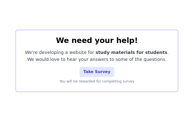 CTA block for "Take our survey"
Get users attention to he survey form
2 years ago9.7k -
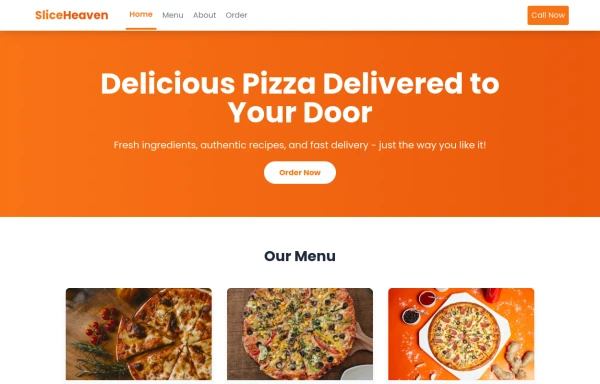 SliceHeaven
delivering pizza
9 months ago808


Explore components by Tags
Didn't find component you were looking for?
Search from 3000+ components