stepper
The Stepper Component is a versatile and user-friendly tool designed to guide users through a sequence of steps. Whether you're building a multi-step form, a tutorial, or any process that requires sequential navigation, this component makes it easy to implement and customize.
This tailwind example is contributed by Abhiraj, on 26-Jan-2025. Component is made with Tailwind CSS v3. It is responsive. It supports dark mode. similar terms for this example are CTA,banner,Info, Show info, Statistics,stepper

Author Abhiraj
Related Examples
-
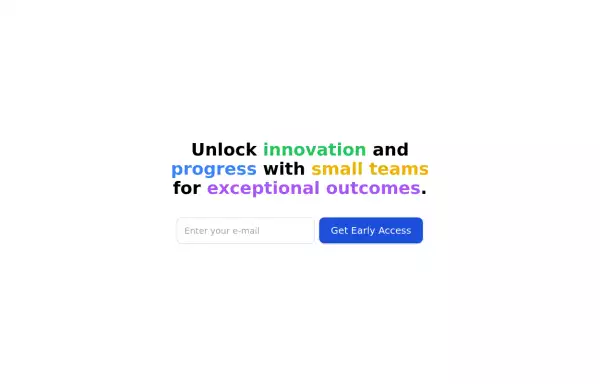
 Domain For Sale Template
Domain For Sale Template
2 years ago4.3k -
 2 years ago5k
 -
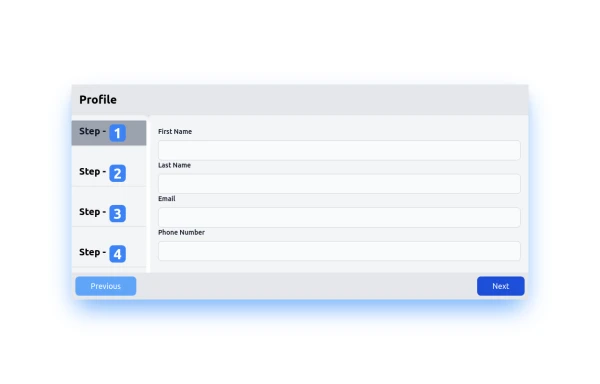 Profile Stepper Form
Progressive Profile Form
1 year ago5.1k -
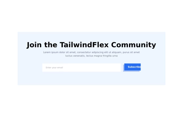 Modern responsive Newsletter form
Responsive newsletter subscriber form
1 year ago3k -
 Chat Bot
Simulation of a chat bot that can be used for conversations as a sketch idea
1 year ago3.7k -
 Modern Dark Footer with Overlapping Gradient CTA
A comprehensive, dark-themed website footer component built with HTML and Tailwind CSS. It features a visually distinct overlapping section with a colorful gradient background containing a prominent call-to-action (CTA) block. The main footer area utilizes a multi-column grid layout for organized navigation links, a newsletter signup form, and social media icons. A final bottom bar includes legal links and copyright information. The design is responsive and adapts its layout for different screen sizes.
11 months ago1.1k -
 9 months ago849
 -
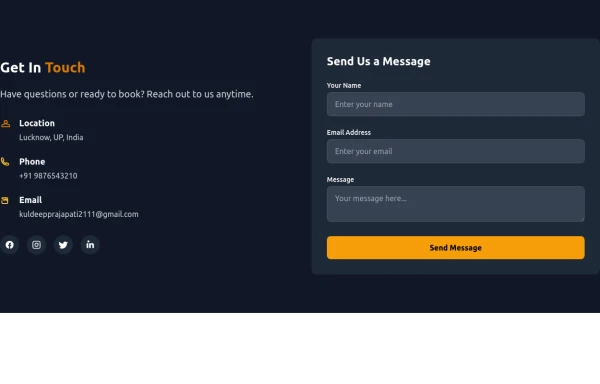 Contact Us Form
CTAs help convert visitors into action-takers (customers, subscribers, etc.), while Contact Us forms enable easy communication, building trust and support. Both are vital for engaging visitors and achieving your website’s objectives.
9 months ago935 -
 8 months ago701
 -
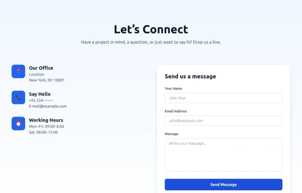 Modern Contact Section with Responsive Grid and Glassmorphic Form
A clean, professional contact section with a dual-column layout featuring contact details and a sleek glassmorphism-inspired form. Fully responsive with Tailwind CSS, supporting both light and dark modes.
8 months ago757 -
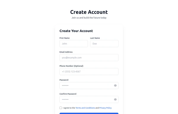 Registration Form with Validation & Success State
A modern and interactive registration form built using Tailwind CSS and Alpine.js, designed for seamless user onboarding with real-time validation and elegant animations. This component includes client-side form validation, dynamic password visibility toggles, and a success confirmation screen with personalized feedback. It’s fully responsive, dark mode–ready, and styled for modern SaaS or startup platforms. ✨ Key Features 🧠 Real-time input validation for required fields (name, email, password, etc.) 🔒 Show/hide password toggle with animated SVG icons ✅ Success message with user details after submission 💨 Animated transitions using Alpine.js 🌙 Dark mode and light mode compatible 📱 Fully responsive across all screen sizes 🧩 Built with pure Tailwind CSS and Alpine.js (no external libraries) 💡 Perfect for: Registration or sign-up pages SaaS onboarding flows Portfolio or agency login systems Form validation demos or UI component libraries
5 months ago298 -


Explore components by Tags
Didn't find component you were looking for?
Search from 3000+ components