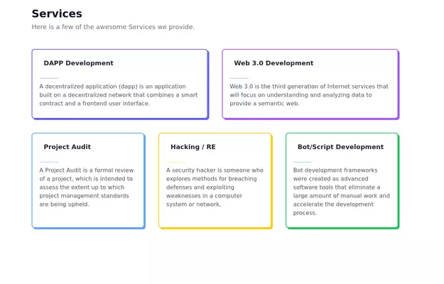
Animated Feature Grid Component with Tailwind CSS
Animated feature grid component built with Tailwind CSS. Features smooth hover animations, gradient cards, dark mode support, and responsive design. Perfect for showcasing product features.
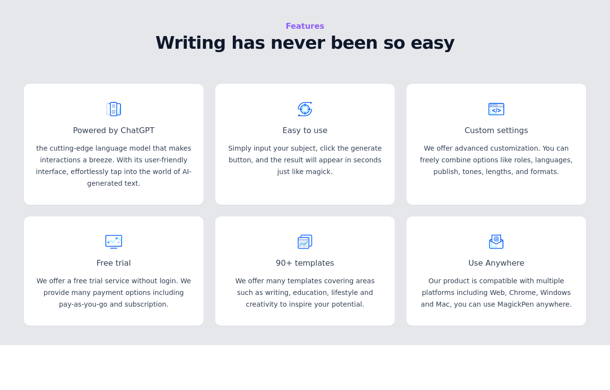
This tailwind example is contributed by Homayoun, on 12-Dec-2025. Component is made with Tailwind CSS v3. It is responsive. It supports dark mode. similar terms for this example are Services,Why choose us

Author Homayoun
Related Examples
-
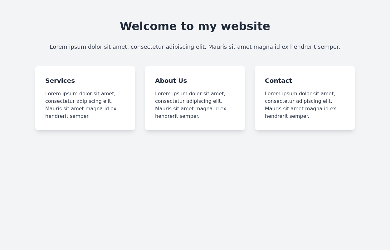
 Responsive Card Grid
Tailwind CSS responsive grid for feature listing. The cards have a teal background, rounded corners, and a concise display of feature titles, descriptions, and a "Learn More" link.
3 years ago52.1k -
 3 years ago13.4k
 -
 Feature Showcase
The feature showcase's responsive grid can also be used as testimonial cards.
3 years ago25.6k -
 3 years ago10.2k
 -
 3 years ago15.4k
 -
 2 years ago14.1k
 -
 3 years ago11k
 -
 Features section
Showcase your key features
3 years ago16.6k -
 2 years ago14.4k
 -
 Work Showcase Cards
Highlight your top projects or products with these cards, featuring images and brief descriptions. This example has a subtle hover effect.
2 years ago12.5k -
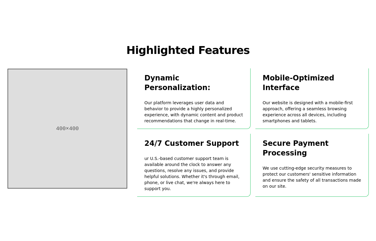
 Feature overview cards
The component is designed to be responsive, featuring a title, a brief description, and a set of cards presenting key metrics.
2 years ago5.4k -
 1 year ago2.9k


Explore components by Tags
Didn't find component you were looking for?
Search from 3000+ components