Simple tailwind footer
Simple tailwind footer with newsletter
This tailwind example is contributed by Laurits, on 07-Jan-2023. Component is made with Tailwind CSS v3. It is responsive.

Author Laurits
Related Examples
-
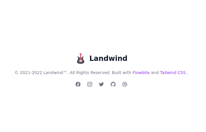
 Footer for blog
https://github.com/tailwindow/component
3 years ago18.3k -
 3 years ago16k
 -
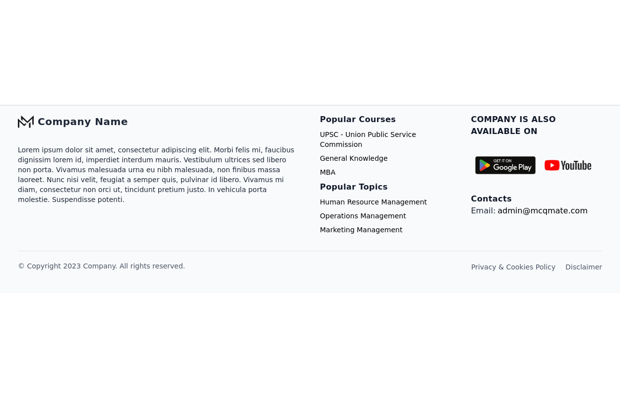 Responsive footer
Footer section with icons
3 years ago12.6k -
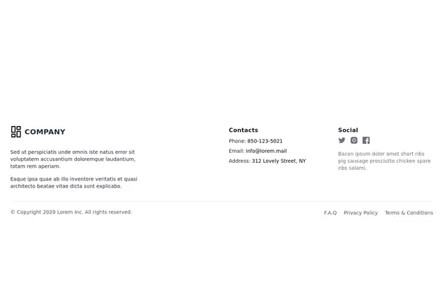 Responsive Footer
source: https://kitwind.io/products/kometa/components/footers
3 years ago16.6k -
 3 years ago11.6k
 -
 10 months ago1.2k
 -
 Footer
A simple footer with link adjustment for smartphones
1 year ago1.4k -
 e-commerce website landing page template with Tailwind CSS.
A clean, responsive e-commerce & blog template built with Tailwind CSS. Features light/dark mode, dynamic featured posts, hero, CTA, and SEO-ready sections.
1 month ago429 -
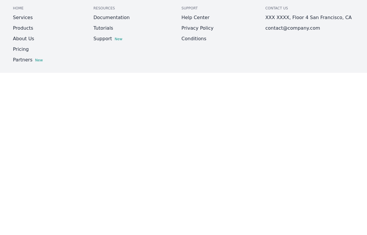
 Responsive Footer Section
This modern and responsive footer adapts seamlessly to all screen sizes, ensuring a clean and organized layout. It includes essential navigation links, contact details, and a subscription form, all structured for easy access. Using display: contents;, the design remains flexible and visually balanced, enhancing the user experience across devices.
10 months ago679 -
 Tailwind Footer with dark version
This example can be used if you are looking for four column footer in dark version with sitemap links, brand logo, and social media accounts.
1 year ago3.6k -
 2 years ago11.4k
 -
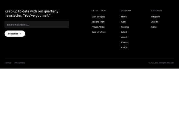
 Basic footer
Basic footer with subscribe to the newsletter section
3 years ago9.7k


Explore components by Tags
Didn't find component you were looking for?
Search from 3000+ components