Small Footer
This tailwind example is contributed by Abhijit Sen, on 13-Jan-2023. Component is made with Tailwind CSS v3. It is responsive.

Author Abhijit Sen
Related Examples
-
 2 years ago15.9k
 -
 3 years ago16.1k
 -
 3 years ago13.9k
 -
 1 year ago1.7k
 -
 1 year ago2k
 -
 beautifull footer
We create a Advance animated footer section using tailwindcss and custom css
1 year ago2.4k -
 Newsletter Footer
Fully Responsive newsletter footer page
1 year ago2k -
 Footer
A simple footer with link adjustment for smartphones
1 year ago1.4k -
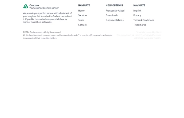
 Footer - Modern minimal style
clean and uncluttered, following a minimalist approach
1 year ago4.4k -
 2 years ago6.5k
 -
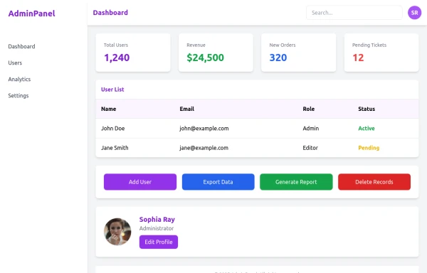 admin panel UI
Premium Admin Panel Pack including sidebar navigation, top navbar, dashboard cards, user tables, quick actions, profile section, and footer. Fully responsive with modern clean design using Tailwind CSS.
6 months ago1.6k -
 canvas fully covers
canvas fully covers
1 year ago3.8k


Explore components by Tags
Didn't find component you were looking for?
Search from 3000+ components